
Neumorphism Posters
First identified as a distinct trend in late 2019 through the work of Ukrainian designer Alexander Plyuto, neumorphism arose as a response to the starkness of flat design and the literal mimicry of skeuomorphism. Its philosophy centers on evoking tactile depth using soft shadows and restrained palettes, suggesting physicality without imitating real-world materials. Neumorphism pursues a modern sense of subtle luxury by crafting interfaces that feel both substantial and abstract.
5 credits for new user registration. No credit card required.
Create Your Own Neumorphism Poster
Use our AI generator to design Neumorphism posters in seconds with full commercial rights.
Create Neumorphism Poster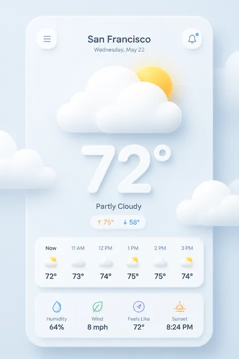


The Art of Neumorphism?
Turn Ideas into Art in Seconds
Describe Your Vision
Simply type your idea or concept for the poster.
Select Neumorphism Style
Our AI applies the specific Neumorphism design rules to your concept.
Customize & Download
Fine-tune colors, add text, and export in high-resolution.
Why Designers Choose Us
The professional choice for AI-generated design
Instant Speed
Results in < 30s
CC0 License
100% Commercial Use
Fully Editable
Layer-by-layer control
High Res
Print-ready quality
About Neumorphism Design
History of Neumorphism
Design Philosophy
Related Keywords
Neumorphism FAQ
Quick answers about designing Neumorphism posters.
What is Neumorphism and how did it originate?
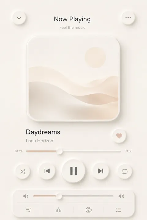
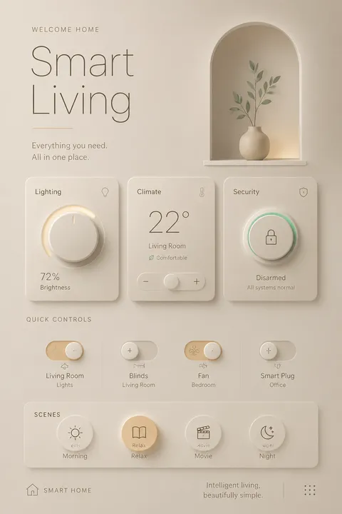
Neumorphism, also called 'Soft UI,' combines 'New' and 'skeuomorphism' to describe a design approach coined by Michal Malewicz in 2019. The style positions itself between flat design's simplicity and skeuomorphism's realistic textures. Neumorphism creates interfaces where elements appear to extrude from or press into the background rather than floating above it, achieved through careful manipulation of soft shadows and highlights to simulate physical depth.
What are the defining visual characteristics of Neumorphic design?
Neumorphism is characterized by its soft, light appearance using pastel colors with low contrast. Elements typically match the background color and are distinguished only through dual shadows—one light, one dark—creating raised or sunken effects. Rounded corners soften edges for seamless transitions. The technique applies a light shadow to the top-left (simulating highlight) and a dark shadow to the bottom-right, producing that distinctive embossed or debossed appearance.
What color palette works best for Neumorphic interfaces?
Neumorphism thrives with soft, muted palettes—shades of gray, off-white, and light pastels enhance the subtle shadow and highlight effects. A gray-on-white scheme is particularly effective, allowing depth and dimension to stand out without color distractions. Bold or highly saturated colors undermine the style's gentle aesthetic. The monochromatic approach ensures shadows remain visible while maintaining the cohesive, tactile appearance central to Neumorphic design.
What accessibility challenges does Neumorphism present?
Neumorphism has received significant criticism for accessibility issues, particularly affecting users with vision impairments or color blindness. The characteristic low contrast between elements and backgrounds makes interaction difficult for many users. Dark mode implementations prove especially problematic. While visually distinctive, the style's subtle differentiation can render interfaces unusable for significant portions of the population, requiring designers to carefully balance aesthetics with inclusive design principles.
Ready to design your next poster?
Create Neumorphism Poster