
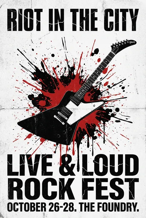
Grunge Posters
Originating in late 1980s Seattle alongside the grunge music movement, this design style took shape through the work of figures like Art Chantry and David Carson, who embraced raw, distressed visuals in opposition to mainstream polish. Grunge design treats visible imperfection as a mark of authenticity, privileging decay, disorder, and the aesthetics of damage as acts of resistance against commercialized, sanitized visual culture.
5 credits for new user registration. No credit card required.
Create Your Own Grunge Poster
Use our AI generator to design Grunge posters in seconds with full commercial rights.
Create Grunge Poster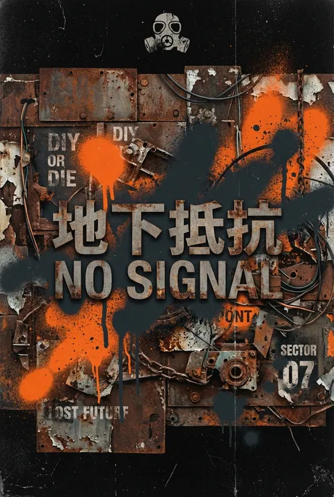
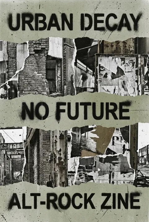
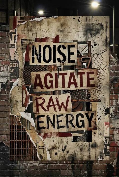
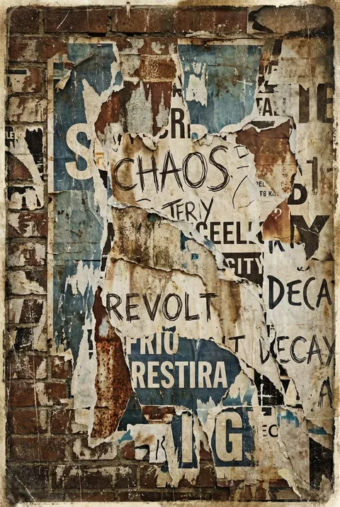
The Art of Grunge?
Turn Ideas into Art in Seconds
Describe Your Vision
Simply type your idea or concept for the poster.
Select Grunge Style
Our AI applies the specific Grunge design rules to your concept.
Customize & Download
Fine-tune colors, add text, and export in high-resolution.
Why Designers Choose Us
The professional choice for AI-generated design
Instant Speed
Results in < 30s
CC0 License
100% Commercial Use
Fully Editable
Layer-by-layer control
High Res
Print-ready quality
About Grunge Design
History of Grunge
Design Philosophy
Related Keywords
Grunge FAQ
Quick answers about designing Grunge posters.
What are the origins of grunge graphic design?
The grunge aesthetic originated from punk music, graffiti, and skateboarding culture, paving the way for experimental typography and grunge-style posters. This early 90s grunge trend saw a rise in more experimental, less polished design styles, inspired by underground rock culture, and was all about breaking the rules of traditional graphic design.
What typography styles define grunge design?
For more impact, condensed sans serifs were applied to grunge style and 90s rave posters. In terms of typography, all kinds of experiments were allowed: bright borders and glowing around letters, combinations of different fonts, distorted fonts, and even effects like floating 3D text. There were lots of handmade posters, handwritten fonts, and grunge textures applied to posters.
What color palettes work best for grunge design?
Balance muted and bold tones: Combine earthy hues with occasional pops of vibrant colors to create a balanced yet dynamic palette. Pair colors that naturally complement each other, such as deep greens with rusty reds, to achieve a cohesive look. Embrace imperfection: Don't be afraid to use colors that might seem mismatched at first glance; the grunge aesthetic thrives on a sense of rebellion.
How to create a retro 90s grunge photo effect in Photoshop?
Use a watercolor image as a 90s grunge background, and desaturate it by going to Image > Adjustments > Hue and Saturation and lowering the Saturation to -100. Go to the bottom of your Layers panel and select the New Adjustment Layer for Posterize. Set the Levels to 8 for a nice grunge effect.
Who is considered the father of grunge design?
David Carson famously designed Ray Gun magazine, the ultimate grunge-style magazine, and the style was widely adopted on posters and album covers. Looking at 90s poster design, it was a wild experiment with colors, shapes, dimensions, and typography. Graphic design editing software like Photoshop first emerged exactly in this decade.
Ready to design your next poster?
Create Grunge Poster