
Aura Gradient Posters
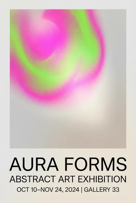
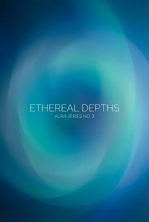
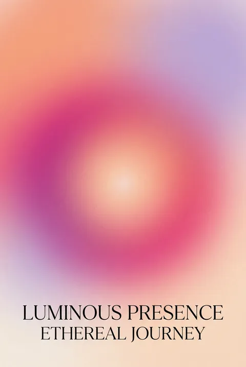
Originating in the late 2010s at the crossroads of wellness visual culture, Instagram aesthetics, and Apple’s evolving interface design, Aura Gradient reflects renewed fascination with personal energy fields and spiritual photography. Its philosophy envisions design as an immersive atmosphere, favoring gentle transitions and luminous color flows to evoke tranquility and transcendence—an invitation to pause and experience visual serenity amid digital noise.
5 credits for new user registration. No credit card required.
Create Your Own Aura Gradient Poster
Use our AI generator to design Aura Gradient posters in seconds with full commercial rights.
Create Aura Gradient Poster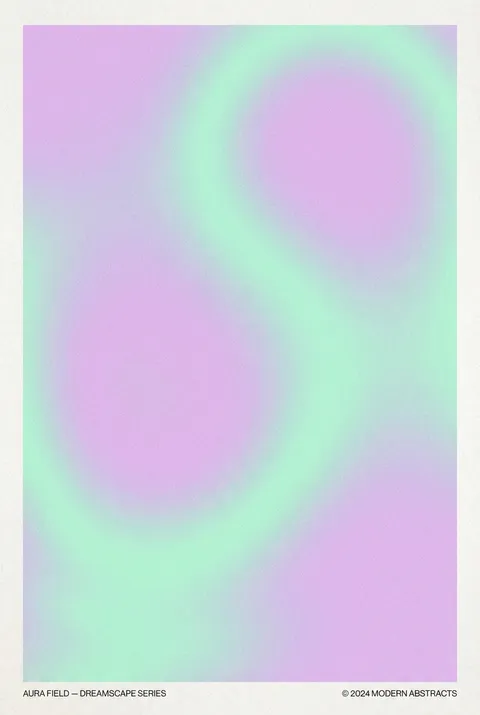
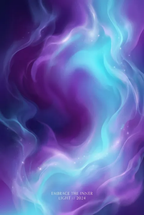
The Art of Aura Gradient?
Turn Ideas into Art in Seconds
Describe Your Vision
Simply type your idea or concept for the poster.
Select Aura Gradient Style
Our AI applies the specific Aura Gradient design rules to your concept.
Customize & Download
Fine-tune colors, add text, and export in high-resolution.
Why Designers Choose Us
The professional choice for AI-generated design
Instant Speed
Results in < 30s
CC0 License
100% Commercial Use
Fully Editable
Layer-by-layer control
High Res
Print-ready quality
About Aura Gradient Design
History of Aura Gradient
Design Philosophy
Related Keywords
Aura Gradient FAQ
Quick answers about designing Aura Gradient posters.
What is the aurora gradient design trend?
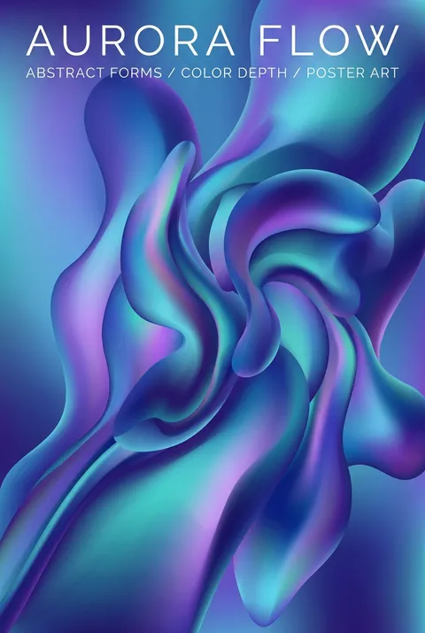
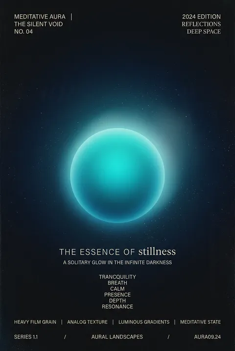
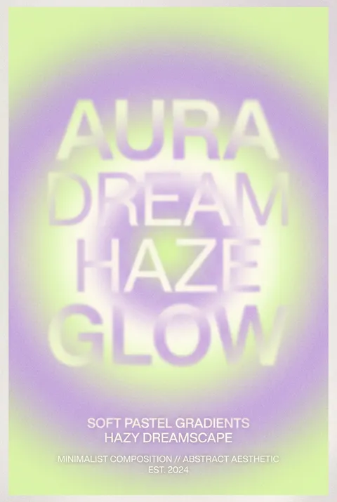
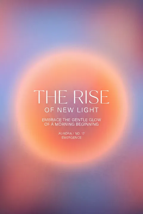
The gradient graphic design trend is often referred to as 'aurora' after the aurora borealis (northern lights). At its core, gradient design (or aurora design) is the use of blended colors that transition smoothly into one another. Today's gradients aren't just about smooth color transitions—the trend has evolved, integrating new elements like grainy layers and blurs for a dreamy aesthetic.
How have gradient designs evolved in 2024?
In 2024, gradients are starting to look more abstract, interesting and artistic. Using bright colors or experimenting with unpopular color tones can make a design really stand out. This shift from sterile, digital gradients to textured, imperfect designs reflects a broader movement in the creative industry—where authenticity, depth, and uniqueness are prioritized over perfection.
What types of gradients are commonly used?
Common types include: Linear gradients (color transitions in a straight line), Radial gradients (a circular blend, often used for spotlight effects), Angular gradients (color shifts that rotate around a central point), and Mesh gradients (complex, multi-directional blends for an artistic effect). Gradients can make a flat design feel three-dimensional and textured.
Where are gradients commonly used in design?
From branding and packaging to website design and social media, gradients are everywhere—bringing depth, energy, and lots of color to visuals. Gradients are also one of the hottest logo trends in 2024. From subtle, two-tone transitions to rainbow-like spectrums, gradients in logos can convey a brand's energy and ethos in a visually striking way.
Why are gradients so popular in modern design?
Unlike solid colors, gradients can make a flat design feel three-dimensional and textured. This is especially effective in digital environments. Colors evoke emotions, and gradients can amplify that effect by blending multiple shades that tell a story. The trend is versatile and can be applied across various design contexts.
Ready to design your next poster?
Create Aura Gradient Poster