
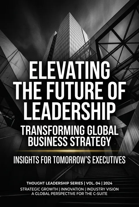
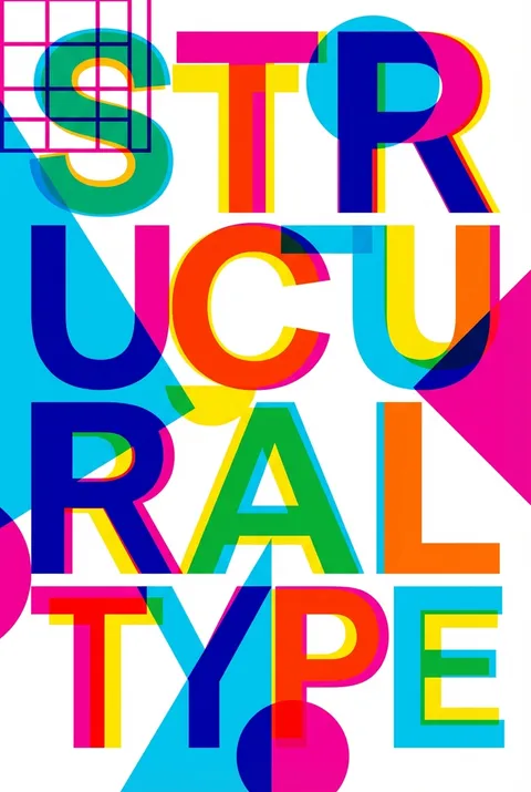
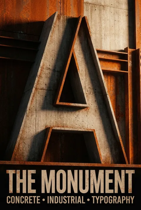
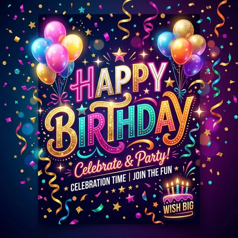
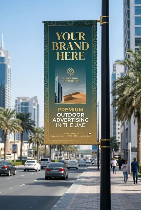
Bold Typography Posters
Create bold typography posters with oversized type, high-contrast layouts, editorial text art, and editable AI poster templates built around words.
5 credits for new user registration. No credit card required.
Create Your Own Bold Typography Poster
Use our AI generator to design Bold Typography posters in seconds with full commercial rights.
Create Bold Typography Poster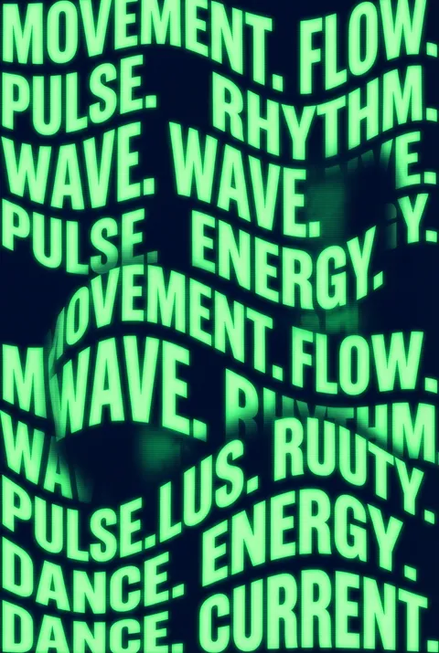


The Art of Bold Typography?


Turn Ideas into Art in Seconds
Describe Your Vision
Simply type your idea or concept for the poster.
Select Bold Typography Style
Our AI applies the specific Bold Typography design rules to your concept.
Customize & Download
Fine-tune colors, add text, and export in high-resolution.
Why Designers Choose Us
The professional choice for AI-generated design
Instant Speed
Results in < 30s
CC0 License
100% Commercial Use
Fully Editable
Layer-by-layer control
High Res
Print-ready quality
About Bold Typography Design
History of Bold Typography
Design Philosophy
Bold Typography FAQ
Quick answers about designing Bold Typography posters.
How and where to use bold typography?
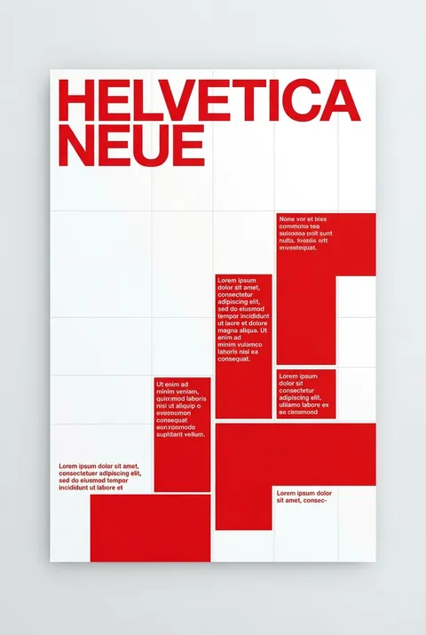
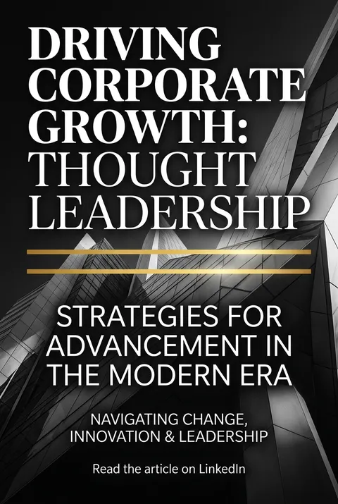
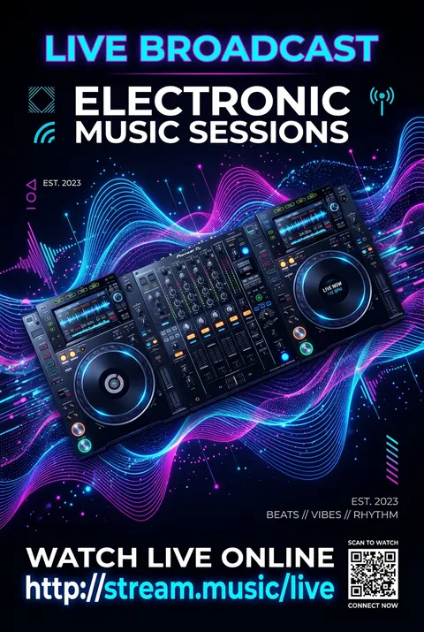
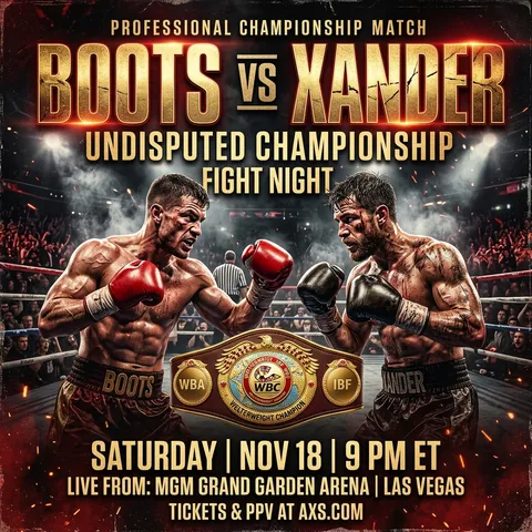
Thick fonts might be more appropriately called Heavy or Ultra Bold—the use of bolds and heavies are to make heavy emphasis. It's like SHOUTING, so the bottom line is to use bold typography in publications or visual communications when the words need to stand out dramatically. Use it sparingly.
What is the psychology behind bold typography?
Bold typography conveys confidence, urgency, and importance. Heavy typefaces command attention and create immediate visual impact. They work best for headlines, calls-to-action, and key messages that need to be seen first. The visual weight signals to readers that this information matters.
What fonts work best for bold typography posters?
Display fonts with high x-heights and consistent stroke widths work exceptionally well. Sans-serif fonts like Helvetica Bold, Futura Extra Bold, and modern geometric typefaces create clean, impactful designs. Slab serifs like Rockwell add character while maintaining legibility at large sizes.
How do I balance bold typography with other design elements?
Bold typography needs breathing room to be effective. Use generous margins and negative space to let the type command attention. Limit your color palette and avoid competing visual elements. The type should be the hero—everything else supports it.
What are common bold typography design trends?
Current trends include oversized type that bleeds off the edge, kinetic typography in motion graphics, variable fonts that animate between weights, mixed-weight compositions, and typography as the sole visual element. Brutalist approaches using bold system fonts have also gained popularity.
Ready to design your next poster?
Create Bold Typography Poster