
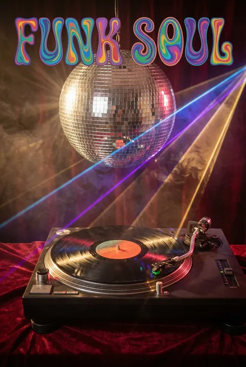
Psychedelic Posters
Psychedelic design arose in mid-1960s San Francisco, as artists like Wes Wilson and Victor Moscoso sought to express the counterculture’s fascination with altered states of consciousness. Its philosophy challenges conventional representation, insisting that only new visual languages—fluid forms, vibrating colors, and warped typography—can evoke the disorienting, transcendent sensations of non-ordinary perception. Here, design aims not to communicate, but to transport.
5 credits for new user registration. No credit card required.
Create Your Own Psychedelic Poster
Use our AI generator to design Psychedelic posters in seconds with full commercial rights.
Create Psychedelic Poster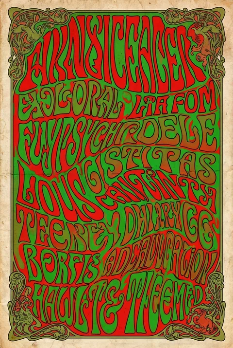
The Art of Psychedelic?
Turn Ideas into Art in Seconds
Describe Your Vision
Simply type your idea or concept for the poster.
Select Psychedelic Style
Our AI applies the specific Psychedelic design rules to your concept.
Customize & Download
Fine-tune colors, add text, and export in high-resolution.
Why Designers Choose Us
The professional choice for AI-generated design
Instant Speed
Results in < 30s
CC0 License
100% Commercial Use
Fully Editable
Layer-by-layer control
High Res
Print-ready quality
About Psychedelic Design
History of Psychedelic
Design Philosophy
Related Keywords
Psychedelic FAQ
Quick answers about designing Psychedelic posters.
What are the hallmarks of San Francisco psychedelic poster art style?
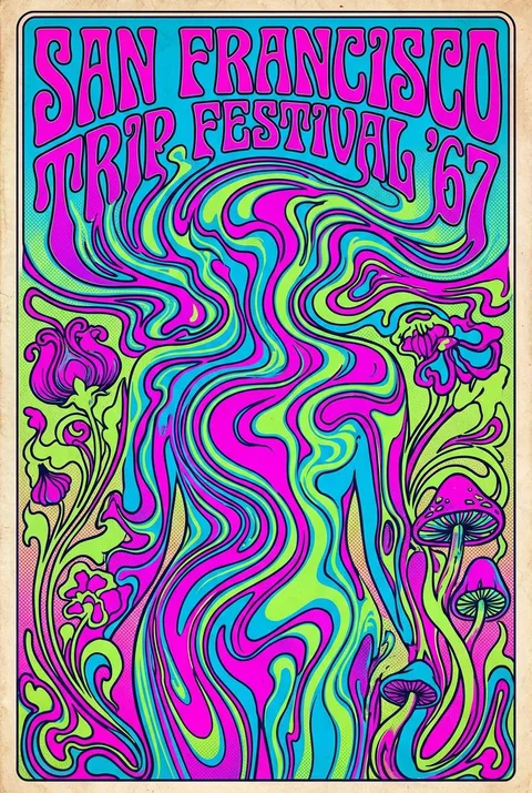
Richly saturated colors in glaring contrast, elaborately ornate lettering, strongly symmetrical composition, collage elements, rubber-like distortions, and bizarre iconography are all hallmarks of the San Francisco psychedelic poster art style. Victor Moscoso used the concept of vibrating colors to create the 'psychedelic' effect in many of his pieces. The vibration is achieved by taking colors from the opposite end of the color wheel, each one having equal value and intensity.
Who was Wes Wilson and why was he important?
Wes Wilson was one of the best-known designers of psychedelic posters. Most well known for designing posters for Bill Graham of The Fillmore in San Francisco, he invented a style that is now synonymous with the peace movement, psychedelic era, and the 1960s. In particular, he is known for inventing and popularizing a psychedelic font around 1966 that made the letters look like they were moving or melting.
What was the philosophy behind psychedelic poster design?
The psychedelic formula was to create posters that were nearly illegible, keeping the viewer engaged (or confused) for as long as possible. Moscoso became adept at integrating electric colors and arranging them in ways that made his posters look as if the images were moving on the paper. The jarring, almost dayglow, colors were meant to appeal to the hippie subculture at the time, which rejected any form of conventional aesthetic.
What influences shaped psychedelic poster design?
Many of the San Francisco-based artists responsible for the psychedelic look of the 1960s posters were inspired by the aesthetic of Art Nouveau. These '60s poster artists fused elements from Art Nouveau with art from early comic books and surrealism, and then cranked the color contrast up to 11! Leading proponents included Rick Griffin, Victor Moscoso, Bonnie MacLean, Stanley Mouse & Alton Kelley, Bob Masse, and Wes Wilson.
Who were the 'Big Five' of psychedelic poster art?
Moscoso with Rick Griffin, Wes Wilson, Stanley Mouse, and Alton Kelley, were known as the 'Big Five' of San Francisco psychedelic poster artists. They formed a design studio called 'Berkeley-Bonaparte.' The style flourished from about 1966 to 1972. Moscoso was the first of the San Francisco psychedelic poster artists to exhibit at the New York Museum of Modern Art.
Ready to design your next poster?
Create Psychedelic Poster