
Neon Sign Posters
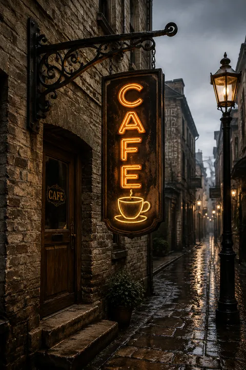
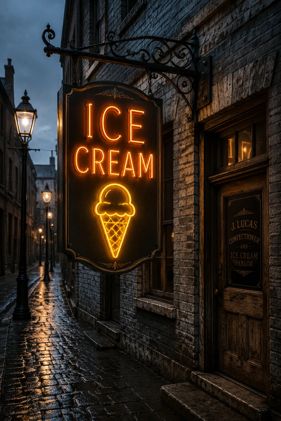
Rising to prominence between the 1920s and 1960s, neon sign design grew from the hands of skilled glass benders shaping luminous tubes into expressive commercial icons. The philosophy centers on honoring the material constraints of bent glass, embracing letterforms and imagery only possible within those physical limits. This approach foregrounds authenticity, celebrating both the endangered craft and the distinctive visual language born from its technical challenges.
5 credits for new user registration. No credit card required.
Create Your Own Neon Sign Poster
Use our AI generator to design Neon Sign posters in seconds with full commercial rights.
Create Neon Sign Poster
The Art of Neon Sign?
Turn Ideas into Art in Seconds
Describe Your Vision
Simply type your idea or concept for the poster.
Select Neon Sign Style
Our AI applies the specific Neon Sign design rules to your concept.
Customize & Download
Fine-tune colors, add text, and export in high-resolution.
Why Designers Choose Us
The professional choice for AI-generated design
Instant Speed
Results in < 30s
CC0 License
100% Commercial Use
Fully Editable
Layer-by-layer control
High Res
Print-ready quality
About Neon Sign Design
History of Neon Sign
Design Philosophy
Related Keywords
Neon Sign FAQ
Quick answers about designing Neon Sign posters.
What makes neon sign typography distinctive?
Neon sign typography evolved from the physical constraints of bending glass tubes that could hold electrified neon gas. This necessity created characteristic rounded letterforms with continuous strokes and limited sharp angles. Modern neon fonts replicate this authentic glow effect with bold, thick lines designed to stand out in low-light conditions. The style conveys warmth, nostalgia, and nightlife ambiance that digital recreations now bring to various design applications.
What types of fonts work best for neon sign designs?
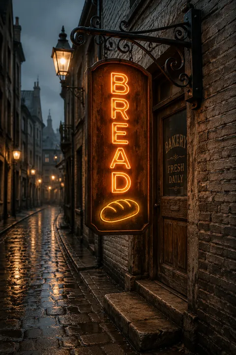
Effective neon fonts prioritize simplicity—clean, straightforward letterforms read clearly from distance. Stroke width matters significantly; thicker strokes appear more prominent when illuminated. Script fonts like Bayshore capture retro neon qualities, while display fonts like Beon and Neonblitz offer authentic vintage aesthetics. Sans-serif options provide modern interpretations. The key considerations are readability, stroke consistency, and avoiding excessive complexity that wouldn't translate well to actual glass tubes.
Why do businesses continue using neon-style signage?
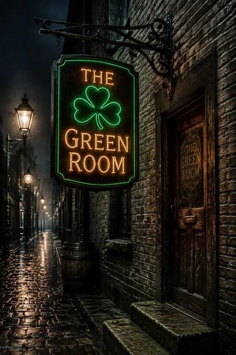
Research shows 85% of consumers are drawn to bright, colorful signs, and retro-inspired neon increases foot traffic by up to 20%. Hospitality, retail, and entertainment businesses embrace vintage neon aesthetics because they create immediate visual impact and emotional warmth. The style evokes nostalgia for classic American roadside culture while remaining contemporary. Whether real glass tubes or LED recreations, neon signage commands attention and establishes memorable brand presence.
How should neon font styles be matched to different atmospheres?
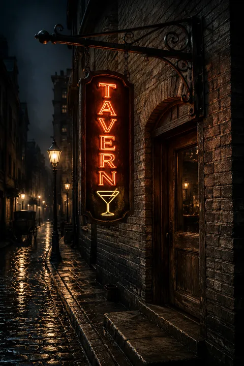
Font selection significantly impacts the mood neon signage creates. Dynamic, bold lettering suits exciting environments like nightclubs and entertainment venues. Retro or vintage-inspired typefaces work best for nostalgic themes like diners, bars, and classic Americana settings. Elegant script fonts with flowing lines are appropriate for luxury establishments, boutiques, and upscale restaurants. The typography should reinforce the intended emotional response while maintaining the characteristic neon glow aesthetic.
Ready to design your next poster?
Create Neon Sign Poster