
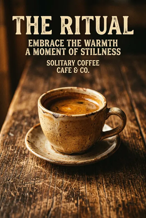
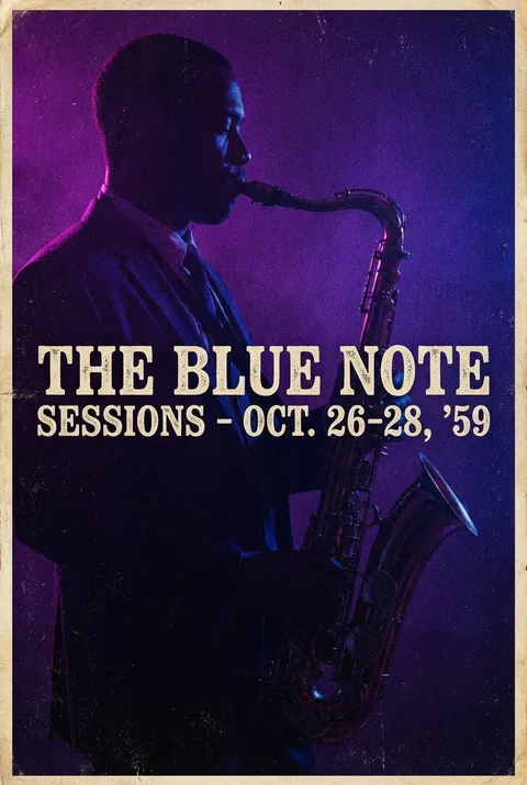
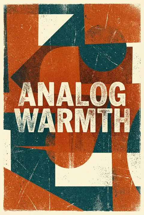
Grainy Texture Posters
Gaining momentum in the 2010s as a counterpoint to digital perfection, grainy texture emerged through illustrators and studios like Tom Haugomat, Dan Matutina, and DKNG, who embraced visible imperfection as a mark of authenticity. This approach values the humanizing presence of process—deliberately introducing grain and surface noise as evidence of hand and material, rejecting algorithmic smoothness in favor of warmth and tactile character.
5 credits for new user registration. No credit card required.
Create Your Own Grainy Texture Poster
Use our AI generator to design Grainy Texture posters in seconds with full commercial rights.
Create Grainy Texture Poster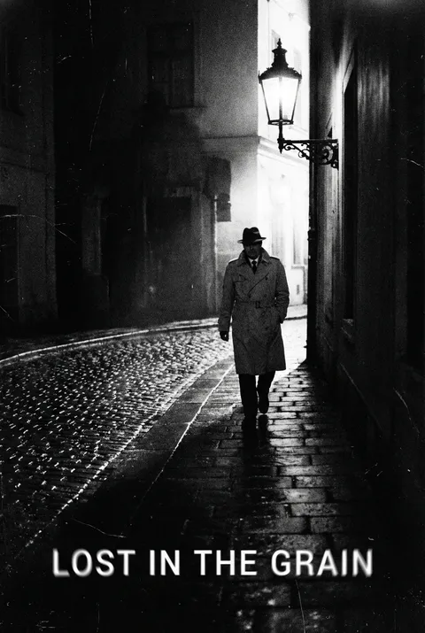
The Art of Grainy Texture?
Turn Ideas into Art in Seconds
Describe Your Vision
Simply type your idea or concept for the poster.
Select Grainy Texture Style
Our AI applies the specific Grainy Texture design rules to your concept.
Customize & Download
Fine-tune colors, add text, and export in high-resolution.
Why Designers Choose Us
The professional choice for AI-generated design
Instant Speed
Results in < 30s
CC0 License
100% Commercial Use
Fully Editable
Layer-by-layer control
High Res
Print-ready quality
About Grainy Texture Design
History of Grainy Texture
Design Philosophy
Grainy Texture FAQ
Quick answers about designing Grainy Texture posters.
What is the grainy texture design style and why is it popular in graphic design?
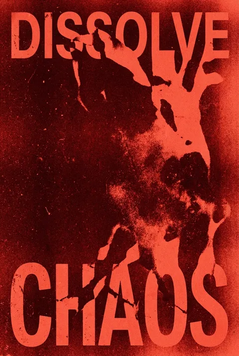
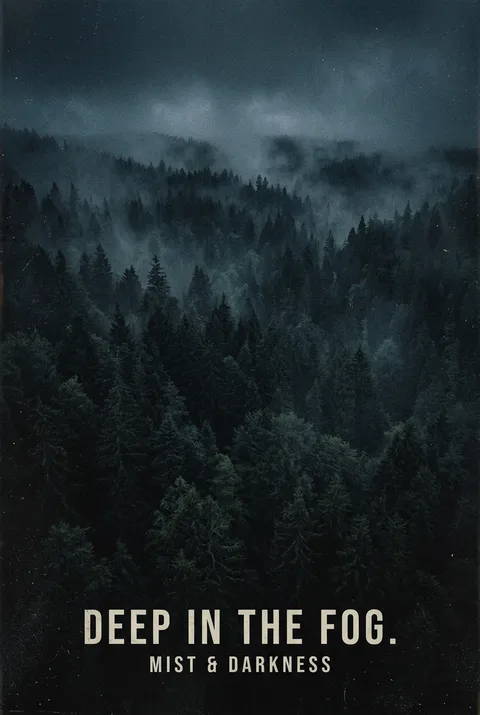
Grainy texture is a visual effect that incorporates small, irregular specks or noise into designs, mimicking the appearance of film grain, paper fibers, or sand. This style has surged in popularity because it adds warmth, depth, and a tactile quality to digital artwork. In an era dominated by flawless AI-generated imagery, grainy textures offer authenticity and a human touch that resonates with audiences seeking something more raw and tangible.
What types of grainy textures can be used in poster design?
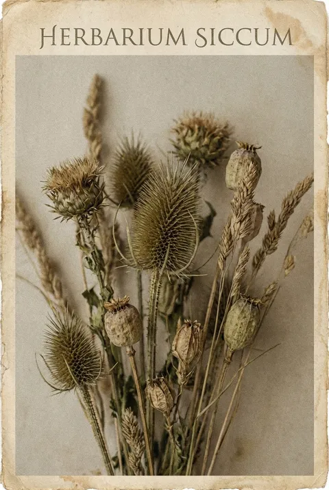
There are four main types commonly used in poster design: film grain that recreates the nostalgic look of vintage photography, sand texture that produces a natural and earthy feel, halftone patterns using dots of varying sizes to simulate gradients, and digital noise that adds randomized pixelation for subtle depth. Each type creates different visual effects—from retro authenticity to modern edginess—depending on your creative goals.
How do grainy textures enhance minimalist and gradient designs?
Grainy textures work beautifully with minimalist layouts by adding visual interest without overwhelming the simplicity of the design. When applied to gradients, the grain softens smooth color transitions and prevents the 'banding' effect common in digital gradients. This combination creates depth and dimension while maintaining a clean aesthetic, making otherwise flat designs feel more sophisticated and tactile.
What tools and techniques are best for creating grainy texture effects?
Most design software like Adobe Photoshop, Illustrator, and Procreate offer noise filters and grain effects that can be adjusted for intensity. The Risograph effect, inspired by Japanese printing techniques from the 1980s, is particularly trendy for achieving authentic grain. For best results, apply grain to gradients, solid backgrounds, or within typography and shapes. Pair the texture with fine-lined graphics or bold colors to create striking visual contrast.
Ready to design your next poster?
Create Grainy Texture Poster