
Frutiger Aero Posters
Coined in the late 2010s to describe the dominant digital aesthetic of 2004–2013, Frutiger Aero arose at the intersection of advancing graphics technology, Web 2.0 optimism, and corporate pushes for approachable, nature-infused branding. Guided by the belief that technology should feel harmonious with the natural world, its design philosophy emphasizes friendliness, organic forms, and a utopian vision of digital progress enriching everyday life.
5 credits for new user registration. No credit card required.
Create Your Own Frutiger Aero Poster
Use our AI generator to design Frutiger Aero posters in seconds with full commercial rights.
Create Frutiger Aero Poster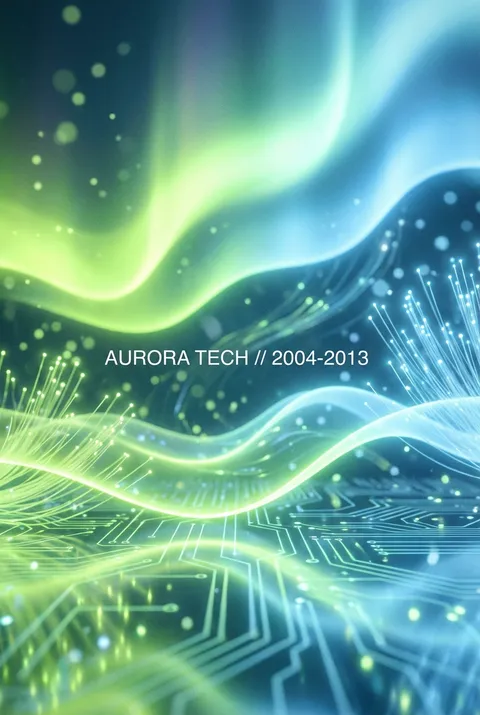
The Art of Frutiger Aero?
Turn Ideas into Art in Seconds
Describe Your Vision
Simply type your idea or concept for the poster.
Select Frutiger Aero Style
Our AI applies the specific Frutiger Aero design rules to your concept.
Customize & Download
Fine-tune colors, add text, and export in high-resolution.
Why Designers Choose Us
The professional choice for AI-generated design
Instant Speed
Results in < 30s
CC0 License
100% Commercial Use
Fully Editable
Layer-by-layer control
High Res
Print-ready quality
About Frutiger Aero Design
History of Frutiger Aero
Design Philosophy
Related Keywords
Frutiger Aero FAQ
Quick answers about designing Frutiger Aero posters.
What is Frutiger Aero and when was it popular?
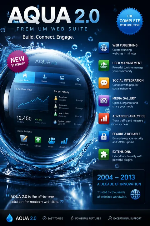
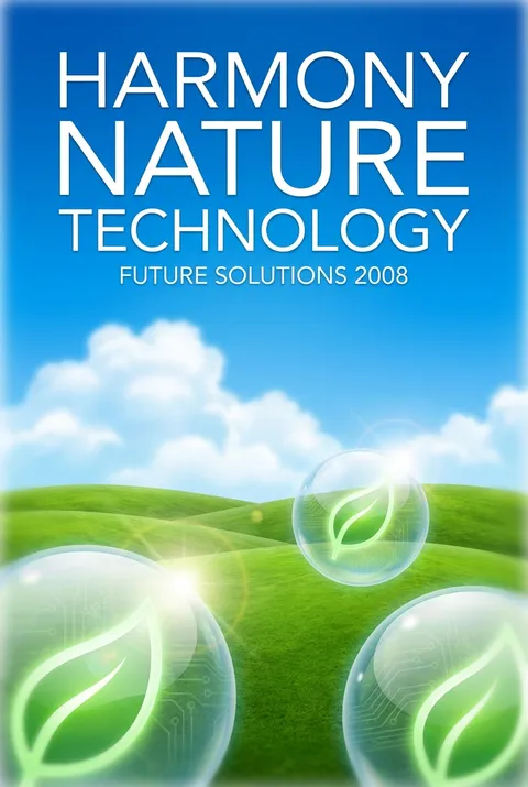
Frutiger Aero was a dominant design aesthetic from approximately 2004 to 2013, named after the Frutiger typeface and Windows Aero design language. It characterized advertising, technology interfaces, and media during this period, representing a transitional style between the busy Y2K aesthetic and later minimalist flat design. The style is most commonly associated with Windows Vista, early iPhone interfaces, and Web 2.0 era websites.
What visual elements define the Frutiger Aero aesthetic?
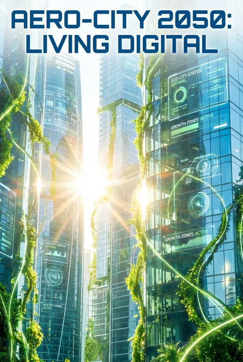
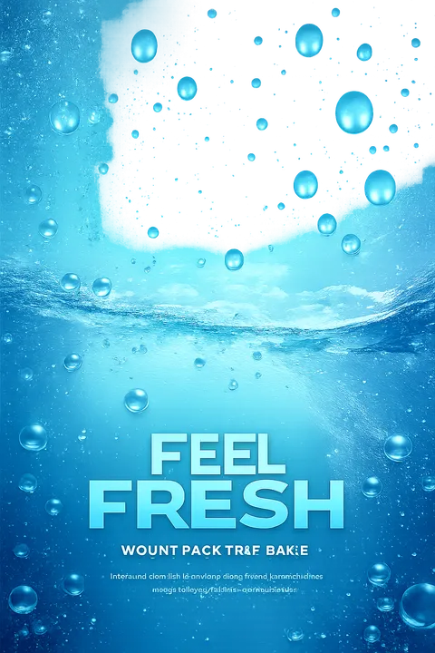
Frutiger Aero is characterized by glossy, reflective surfaces with translucent glass-like materials, vibrant color palettes emphasizing greens and blues, and nature-inspired imagery including skies, water, bubbles, and plant life. The style features skeuomorphic elements, rounded corners, subtle gradients, and a sense of depth through layering. It conveys a harmonious blend of technology and nature, suggesting that digital tools enhance rather than replace the natural world.
Why has Frutiger Aero experienced a nostalgic revival?
The aesthetic resurged in popularity around 2023-2024, particularly among Generation Z users who grew up during its peak. For this generation, Frutiger Aero represents a time when technology felt optimistic and approachable—before the current era of data concerns and digital fatigue. The style's emphasis on harmony between technology and nature resonates with contemporary desires for a more positive relationship with digital tools.
How does Frutiger Aero differ from Y2K aesthetics?
While both are early 2000s design styles, Frutiger Aero conveys more hopefulness and warmth compared to Y2K's edgier, more chaotic visual language. Y2K embraced chrome, harsh metallics, and darker futurism, while Frutiger Aero celebrates organic shapes, nature imagery, and softer gradients. Frutiger Aero essentially represents the maturation of digital design into a more user-friendly, optimistic visual approach.
Ready to design your next poster?
Create Frutiger Aero Poster