
Flat Design Posters
Developed in the early 2010s as a response to skeuomorphic excess, flat design was championed by Microsoft’s Metro language and gained mainstream traction with Apple’s iOS 7 overhaul. The philosophy behind flat design embraces digital honesty, rejecting mimicked textures and depth in favor of simplicity, clarity, and functional visual hierarchy. Decoration is minimized so that essential content and interaction remain unmistakably clear.
5 credits for new user registration. No credit card required.
Create Your Own Flat Design Poster
Use our AI generator to design Flat Design posters in seconds with full commercial rights.
Create Flat Design Poster


The Art of Flat Design?
Turn Ideas into Art in Seconds
Describe Your Vision
Simply type your idea or concept for the poster.
Select Flat Design Style
Our AI applies the specific Flat Design design rules to your concept.
Customize & Download
Fine-tune colors, add text, and export in high-resolution.
Why Designers Choose Us
The professional choice for AI-generated design
Instant Speed
Results in < 30s
CC0 License
100% Commercial Use
Fully Editable
Layer-by-layer control
High Res
Print-ready quality
About Flat Design Design
History of Flat Design
Design Philosophy
Related Keywords
Flat Design FAQ
Quick answers about designing Flat Design posters.
What is flat design and what are its key characteristics?
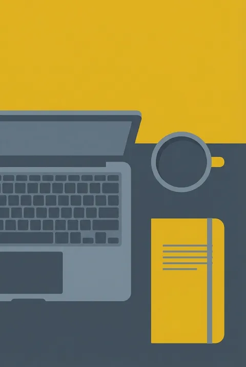
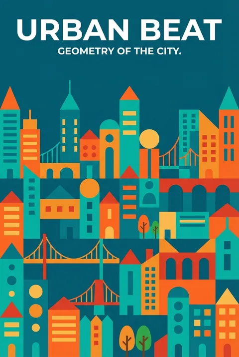
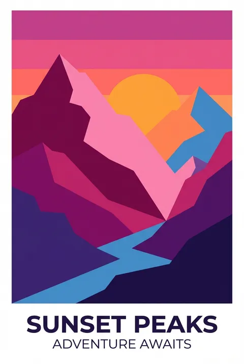
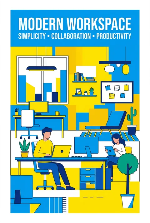
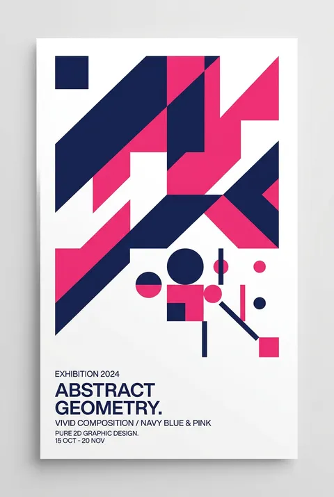
Flat design is a style of interface design emphasizing minimalist use of simple elements, typography, and flat colors. It's a minimalist design language commonly used in graphical user interfaces (GUI) such as web applications and mobile apps, and also in graphical materials such as posters, arts, guide documents and publishing products. Instead of using complex, realistic images, flat design uses simple two-dimensional vector art to depict objects.
What are the core principles of flat design?
Simplicity is central to flat design, prioritizing functionality over unnecessary elements. When you adopt a minimalist approach, you reduce distractions, allowing users to focus on essential tasks. Flat design uses many simple user interface elements, such as buttons and icons. Designers often stick to simple shapes, such as rectangles, circles or squares and allow each shape to stand alone. Key principles include ample whitespace, high-contrast colours, and simple typography.
What colors work best for flat design?
Since flat UI is minimalist by nature, it relies on the use of bright colors to send visual cues to the user. Visual clarity and readability of minimalist fonts that don't have additional details like serifs and decorative twirls is ideal. Flat design steers clear of complex textures like drop shadows or gradients. Whitespace isn't filler—it gives the design space to breathe and helps guide the user's attention naturally.
What is Flat Design 2.0?
Flat design 2.0, or semi-flat design, is the next generation of flat design. It adheres to most of the key principles of fully flat design—ample whitespace, high-contrast colours, simple typography—with the addition of subtle shadows, highlights, and layers. This not-entirely-flat approach adds a touch of depth to the interface, helping to overcome some of the usability issues associated with fully flat design.
What are the 4 characteristics of flat design?
According to MasterClass, the four main characteristics of flat design are: simple shapes and elements using rectangles, circles or squares; bright colors to send visual cues since flat UI is minimalist by nature; simple sans-serif typography that loads fast and is easy to read; and minimal textures, steering clear of complex effects like drop shadows or gradients.
Ready to design your next poster?
Create Flat Design Poster