
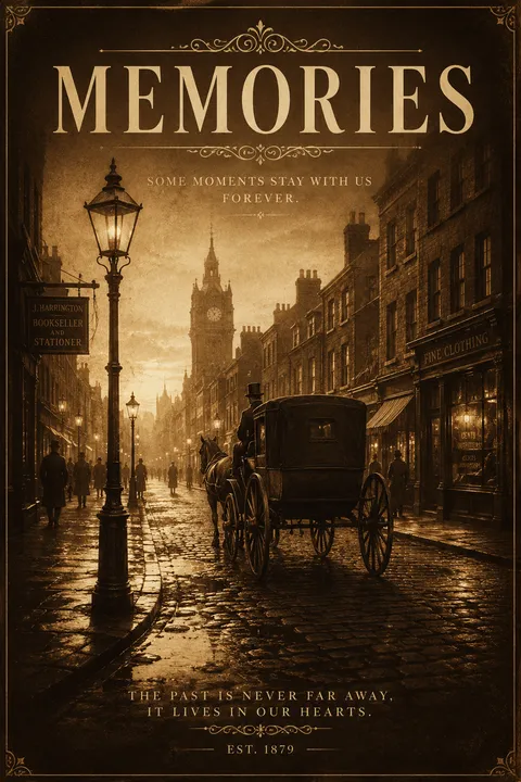
Sepia Posters
Sepia toning emerged in 19th-century photography as both an aesthetic experiment and a means to extend the life of photographic prints. The design philosophy centers on the idea that color itself can serve as a temporal signifier—sepia’s warm brown hues instantly evoke memory and history, transforming ordinary images into visual artifacts of the past. This approach treats palette and texture as narrative devices, conjuring nostalgia through deliberate visual aging.
5 credits for new user registration. No credit card required.
Create Your Own Sepia Poster
Use our AI generator to design Sepia posters in seconds with full commercial rights.
Create Sepia Poster
The Art of Sepia?

Turn Ideas into Art in Seconds
Describe Your Vision
Simply type your idea or concept for the poster.
Select Sepia Style
Our AI applies the specific Sepia design rules to your concept.
Customize & Download
Fine-tune colors, add text, and export in high-resolution.
Why Designers Choose Us
The professional choice for AI-generated design
Instant Speed
Results in < 30s
CC0 License
100% Commercial Use
Fully Editable
Layer-by-layer control
High Res
Print-ready quality
About Sepia Design
History of Sepia
Design Philosophy
Related Keywords
Sepia FAQ
Quick answers about designing Sepia posters.
What is sepia tone and where does it come from?
Sepia tone is a warm, reddish-brown color that originated from the ink of cuttlefish (Sepia Officinalis). In photography, it became popular in the 1880s when photographers used sepia toning chemicals to replace metallic silver with silver sulfide, creating warmer tones while also preserving prints longer. The technique made photographs up to 50% more resistant to environmental damage.
Why does sepia photography evoke nostalgia?
Sepia creates a nostalgic feeling because it mimics the appearance of aged photographs from the late 19th and early 20th centuries. The warm, comforting brown tones soften images and remove color distractions, allowing viewers to focus on composition and subject matter. This visual quality naturally transports viewers to an earlier era, making even modern images feel timeless.
How is sepia different from black and white photography?
While both are monochromatic, sepia uses a warm reddish-brown spectrum instead of grayscale. Black and white photography creates contrast through stark grays, whites, and blacks, often producing dramatic effects. Sepia softens these contrasts with warm tones, giving images a gentler, more romantic quality that conveys emotions more subtly than the bold statement of black and white.
What subjects work best with sepia tone?
Sepia tone excels in portraiture, landscapes, and documentary photography where a timeless or historical feel enhances the narrative. It works particularly well for vintage-themed content, architectural photography, and any subject where you want to emphasize texture and mood over color detail. Wedding photography often uses sepia for romantic, classic-looking images.
Ready to design your next poster?
Create Sepia Poster