
High Contrast Posters
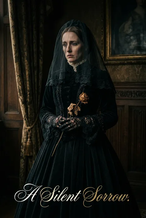
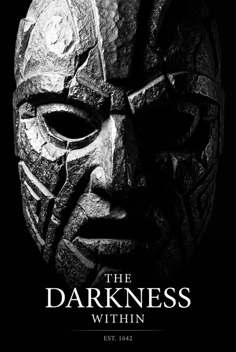
Rooted in ancient visual traditions and refined by artists like Caravaggio and modernist designers such as Saul Bass, high contrast emerged as a strategy for visual drama and clarity across eras. Its philosophy insists on the power of stark opposition—eliminating middle tones to force every element into light or dark, producing compositions charged with tension and immediacy. High contrast design compels attention by transforming visual extremes into unmistakable statements.
5 credits for new user registration. No credit card required.
Create Your Own High Contrast Poster
Use our AI generator to design High Contrast posters in seconds with full commercial rights.
Create High Contrast Poster
The Art of High Contrast?
Turn Ideas into Art in Seconds
Describe Your Vision
Simply type your idea or concept for the poster.
Select High Contrast Style
Our AI applies the specific High Contrast design rules to your concept.
Customize & Download
Fine-tune colors, add text, and export in high-resolution.
Why Designers Choose Us
The professional choice for AI-generated design
Instant Speed
Results in < 30s
CC0 License
100% Commercial Use
Fully Editable
Layer-by-layer control
High Res
Print-ready quality
About High Contrast Design
History of High Contrast
Design Philosophy
Related Keywords
High Contrast FAQ
Quick answers about designing High Contrast posters.
What is high-contrast design and why is it effective?
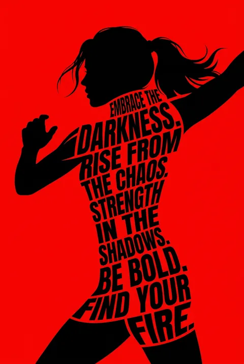
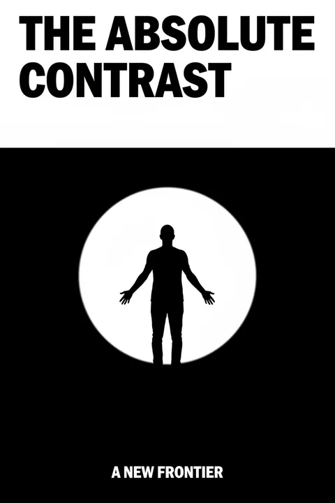
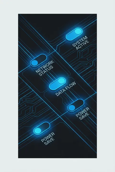
High-contrast design emphasizes strong visual differences between elements in a composition—whether through light versus dark values, complementary colors, or varying sizes. This approach makes designs immediately impactful by ensuring key elements stand out prominently. The maximum contrast achievable is between pure black and white, but bold complementary colors like blue and orange or yellow and purple also create powerful visual tension.
What are the main techniques for creating contrast in poster design?
Six primary techniques drive high-contrast design: value contrast using light and dark tones, color contrast with complementary hues, size contrast where larger elements draw attention, typography contrast mixing weights and styles, texture contrast pairing rough with smooth surfaces, and shape contrast combining curved and angular forms. Strategic use of negative space also creates powerful contrast by letting certain elements breathe while others cluster together.
How does high-contrast design improve visual communication?
Contrast serves multiple functional purposes: it emphasizes focal points so viewers know where to look first, improves readability by separating text from backgrounds, establishes visual hierarchy showing which information matters most, and adds visual interest preventing designs from feeling flat. Without adequate contrast, elements compete for attention and messages become unclear. With intentional contrast, communication becomes immediate and effective.
What common mistakes should be avoided in high-contrast design?
The biggest mistake is using too many contrasting elements simultaneously—if everything is bold, nothing stands out. Choose one or two key elements to emphasize rather than competing contrasts throughout. Avoid random variation that confuses rather than clarifies. Ensure sufficient accessibility by testing readability for all users. Balance high-contrast areas with neutral zones to give viewers' eyes rest, making the contrasting elements more impactful by comparison.
Ready to design your next poster?
Create High Contrast Poster