
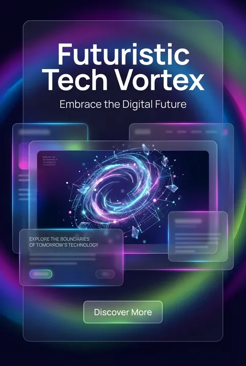
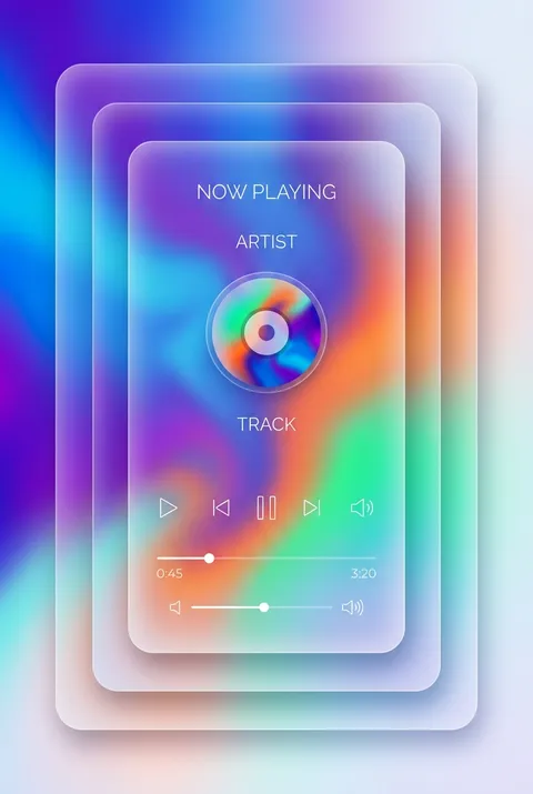
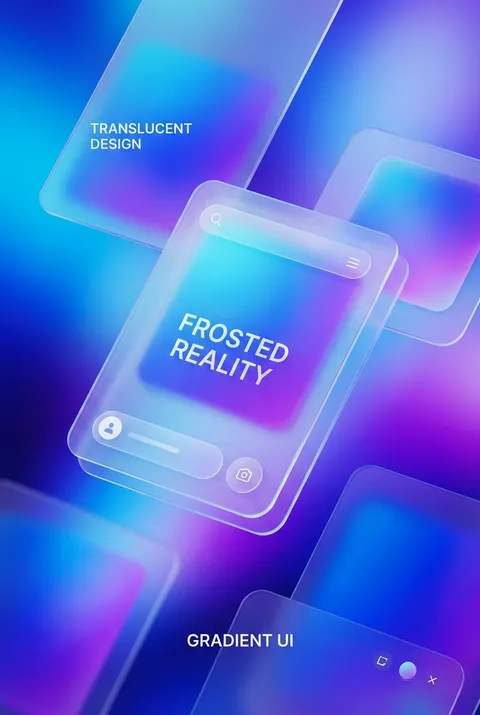
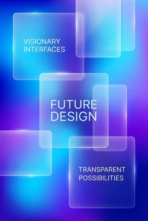
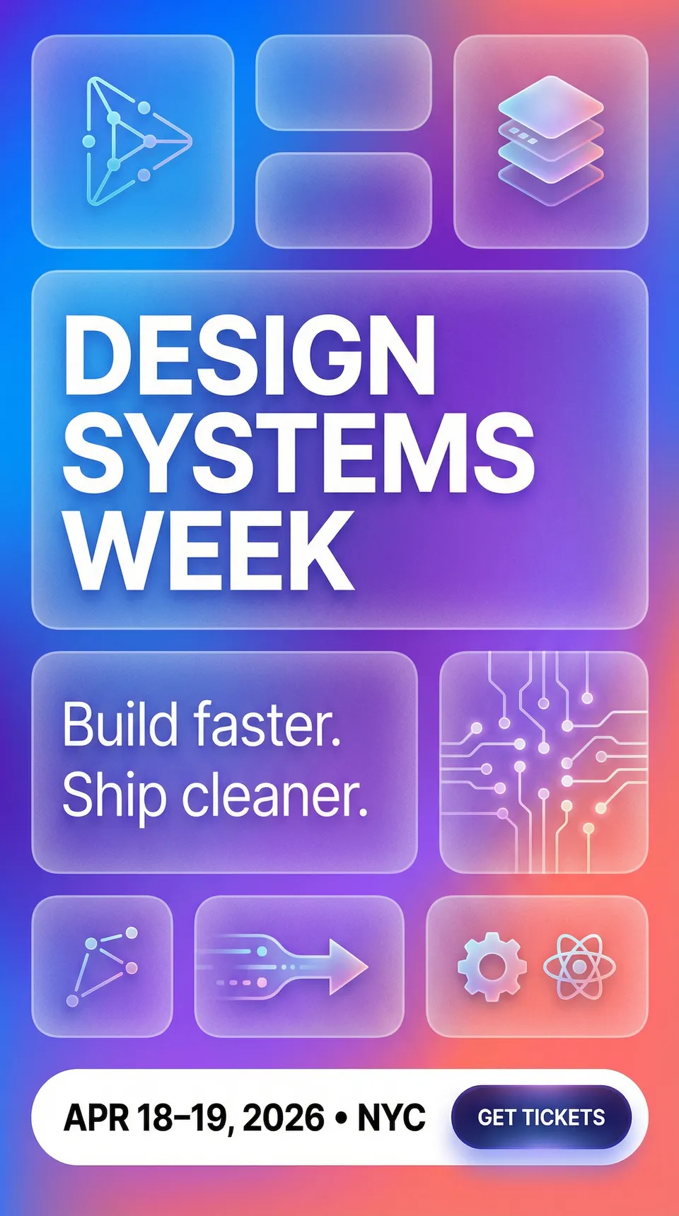
Glassmorphism Posters
Glassmorphism coalesced as a distinct design trend around 2020, building on a lineage of interface experiments from Apple’s iOS 7 and Windows Vista’s Aero Glass, and gaining prominence through online UI communities. Its philosophy centers on revealing digital depth through translucency, framing interfaces as layered spaces where blurred glass-like surfaces both separate and connect content, making spatial relationships visually tangible rather than merely implied.
5 credits for new user registration. No credit card required.
Create Your Own Glassmorphism Poster
Use our AI generator to design Glassmorphism posters in seconds with full commercial rights.
Create Glassmorphism Poster

The Art of Glassmorphism?
Turn Ideas into Art in Seconds
Describe Your Vision
Simply type your idea or concept for the poster.
Select Glassmorphism Style
Our AI applies the specific Glassmorphism design rules to your concept.
Customize & Download
Fine-tune colors, add text, and export in high-resolution.
Why Designers Choose Us
The professional choice for AI-generated design
Instant Speed
Results in < 30s
CC0 License
100% Commercial Use
Fully Editable
Layer-by-layer control
High Res
Print-ready quality
About Glassmorphism Design
History of Glassmorphism
Design Philosophy
Related Keywords
Glassmorphism FAQ
Quick answers about designing Glassmorphism posters.
What is glassmorphism in UI design?
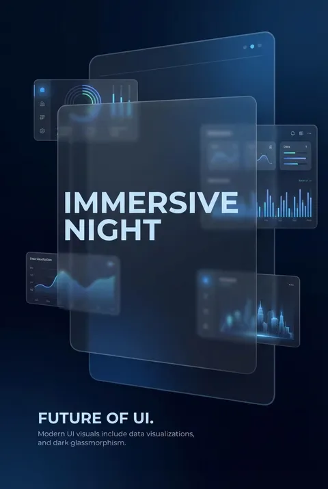
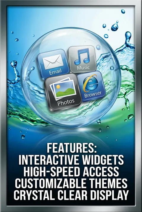
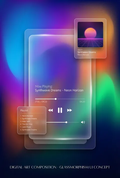
Glassmorphism is a design trend where interface elements appear as translucent frosted glass, allowing users to perceive content layered behind them. Coined by designer Michal Malewicz in 2020, the style creates depth through transparency, background blur, and subtle borders. It became prominent in macOS Big Sur and Windows 11, where Microsoft incorporated it into their Fluent Design System under the name 'Acrylic.'
What are the core visual characteristics of glassmorphism?
Glassmorphism relies on four key elements: semi-transparent backgrounds that allow underlying content to show through, background blur that creates the frosted glass effect, vivid background colors that shine through the translucent layers, and subtle lighting with shadows to suggest floating elements. Light, semi-transparent borders around elements help them stand out against both light and dark backgrounds.
How do designers implement glassmorphism technically?
Creating glassmorphism effects involves manipulating opacity and background blur values. In CSS, this typically uses the backdrop-filter property for blur effects combined with semi-transparent background colors. Designers adjust these parameters to control how much background information remains visible versus obscured. Adding subtle white or dark overlays at 10-30% opacity helps maintain text readability while preserving the glassy aesthetic.
What accessibility concerns exist with glassmorphism?
The primary accessibility challenge with glassmorphism is text readability. When backgrounds are too busy or text lacks sufficient contrast against the translucent surface, content becomes difficult to read. Solutions include adding semi-transparent solid overlays behind text, ensuring adequate color contrast ratios, and testing designs against various background scenarios. Designers must balance aesthetic appeal with functional legibility.
Ready to design your next poster?
Create Glassmorphism Poster