
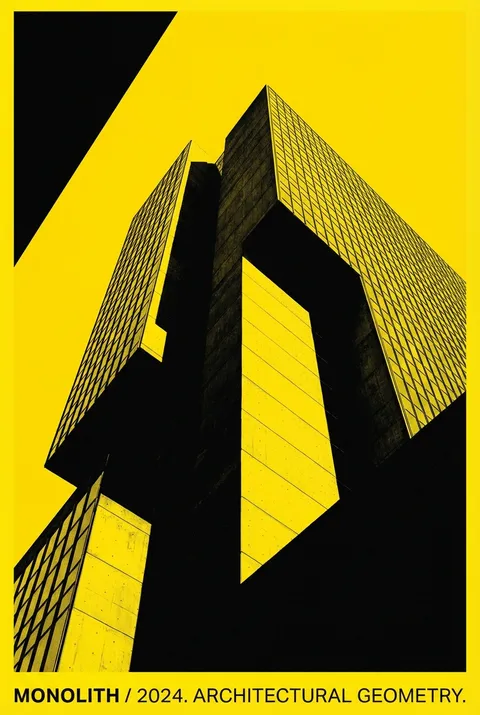
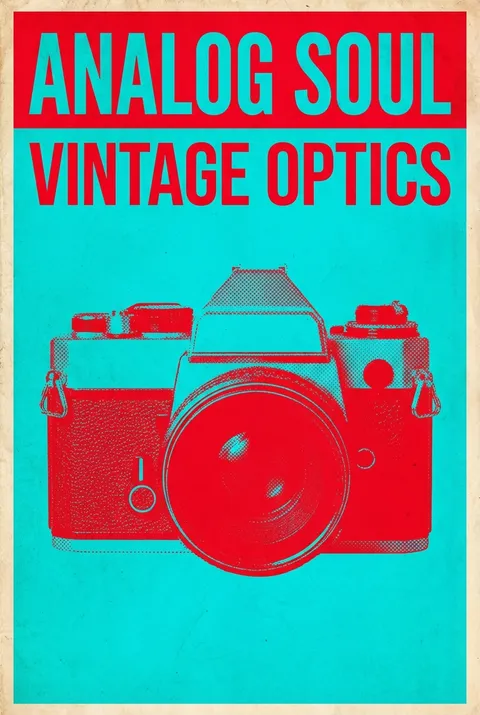
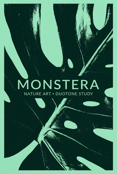
Duotone Posters
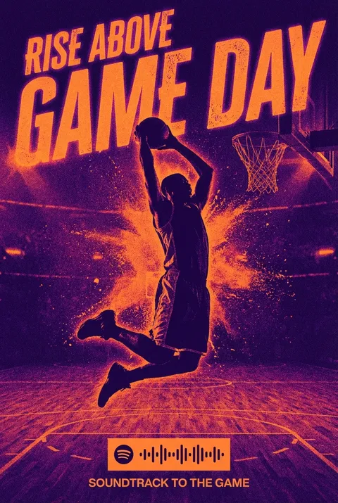
First developed as a cost-effective printing method in the early 20th century, duotone used two ink colors—often black and a warm tone—to enrich photographic reproduction, later invigorated by the bold aesthetics of 1960s pop art and popularized anew through contemporary branding like Spotify. The duotone philosophy asserts that limiting images to two striking colors sharpens graphic clarity, relying on strong contrasts and distilled compositions to create memorable, emotionally resonant visuals.
5 credits for new user registration. No credit card required.
Create Your Own Duotone Poster
Use our AI generator to design Duotone posters in seconds with full commercial rights.
Create Duotone Poster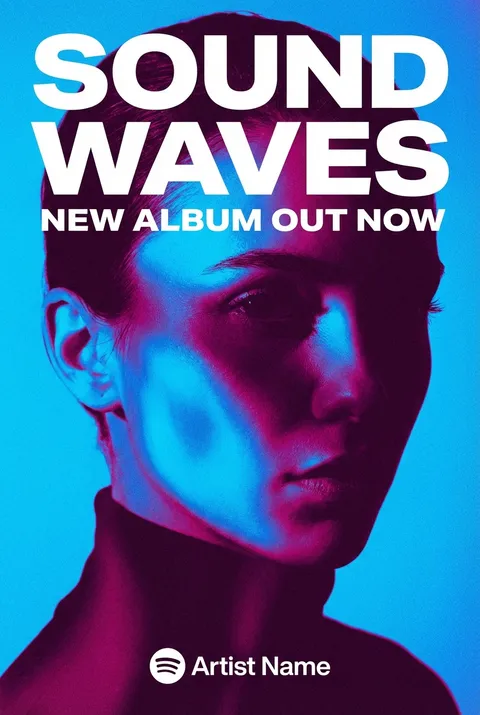
The Art of Duotone?
Turn Ideas into Art in Seconds
Describe Your Vision
Simply type your idea or concept for the poster.
Select Duotone Style
Our AI applies the specific Duotone design rules to your concept.
Customize & Download
Fine-tune colors, add text, and export in high-resolution.
Why Designers Choose Us
The professional choice for AI-generated design
Instant Speed
Results in < 30s
CC0 License
100% Commercial Use
Fully Editable
Layer-by-layer control
High Res
Print-ready quality
About Duotone Design
History of Duotone
Design Philosophy
Related Keywords
Duotone FAQ
Quick answers about designing Duotone posters.
What is duotone design and how does it work?
Duotone is a design technique that uses only two contrasting colors to create an image, with one color replacing the dark tones and another replacing the light tones. The process involves converting an image to grayscale, then mapping two chosen hues to the tonal spectrum. This creates bold, striking visuals with immediate impact while maintaining simplicity and readability.
Why do designers choose duotone over full-color designs?
Duotone offers several advantages: it creates instant visual interest through color contrast, allows text and design elements to stand out clearly, and establishes a cohesive brand identity with limited colors. The technique originated partly as a cost-saving printing method but evolved into a deliberate artistic choice that adds sophistication and focus. The simplicity makes duotone particularly effective for hero images and editorial layouts.
What color combinations create the most effective duotone posters?
Effective duotone pairs typically feature colors with strong contrast in both hue and value. Classic combinations include blue and orange, purple and yellow, or pink and cyan for vibrant energy. For more subdued effects, pairing a dark neutral with a single accent color works well. The psychological associations of your chosen colors should align with your message—warm combinations feel energetic while cool pairs suggest calm professionalism.
Where is duotone design most commonly used today?
Duotone has become popular across web design for hero images and headers, music album artwork where it creates atmospheric moods, event posters that need immediate visual impact, and editorial magazine spreads. Tech companies and startups frequently use duotone to create modern, bold brand imagery. The technique also adapts well to user interfaces, infographics, and social media graphics where limited color palettes enhance clarity.
Ready to design your next poster?
Create Duotone Poster