
Corporate Clean Posters
Rooted in the International Typographic Style of 1950s Switzerland, corporate clean design advanced through the systematic visual identities crafted by figures like Josef Müller-Brockmann, Paul Rand, and Otl Aicher. Its philosophy insists that clarity, consistency, and order foster trust, employing grid-based layouts, restrained color palettes, and legible sans-serif typography to communicate professionalism without distraction or embellishment.
5 credits for new user registration. No credit card required.
Create Your Own Corporate Clean Poster
Use our AI generator to design Corporate Clean posters in seconds with full commercial rights.
Create Corporate Clean Poster


The Art of Corporate Clean?


Turn Ideas into Art in Seconds
Describe Your Vision
Simply type your idea or concept for the poster.
Select Corporate Clean Style
Our AI applies the specific Corporate Clean design rules to your concept.
Customize & Download
Fine-tune colors, add text, and export in high-resolution.
Why Designers Choose Us
The professional choice for AI-generated design
Instant Speed
Results in < 30s
CC0 License
100% Commercial Use
Fully Editable
Layer-by-layer control
High Res
Print-ready quality
About Corporate Clean Design
History of Corporate Clean
Design Philosophy
Corporate Clean FAQ
Quick answers about designing Corporate Clean posters.
What defines corporate clean design style?
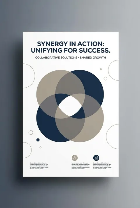
Corporate clean design follows the principle of communicating more by showing less. This minimalist approach strips away unnecessary decorative elements, keeping only what's essential to convey the message clearly. The style features crisp, timeless visuals with simple shapes, solid colors, and uncluttered compositions. It's designed to look sharp and legible at any scale—from business cards to billboards—ensuring consistent brand recognition across all applications.
What are the key techniques in corporate clean design?
Flat design forms the foundation, using simple shapes and solid colors without shadows or 3D effects for a modern, crisp appearance. Negative space is used strategically to create visual interest or reveal subtle secondary imagery. Clean, readable typography keeps focus on the brand message, while monochromatic color schemes using different tones of single colors create sophisticated, unified visuals. Every element serves a clear communicative purpose.
Why do businesses choose minimalist corporate design?
Minimalist corporate design creates associations of calm, order, and professionalism that build positive brand perception. Simple, consistent branding makes it easier for customers to recognize and connect with companies, fostering loyalty over time. Clean design also ensures versatility—logos and visual elements reproduce well across diverse media and contexts. Companies like Apple demonstrate how minimalist aesthetics can convey innovation and premium quality effectively.
How does corporate clean design apply across brand materials?
Corporate visual identity encompasses all brand touchpoints: logos, packaging, business cards, websites, and marketing materials. Designers apply minimalist principles consistently across these components, maintaining visual coherence while adapting to different formats. The focus on reduction and precision means fewer type choices, solid colors, and simple geometric forms that work harmoniously together. This restraint actually strengthens brand communication by eliminating visual noise.
Ready to design your next poster?
Create Corporate Clean Poster