
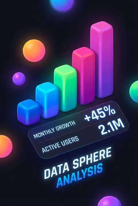
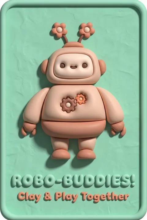
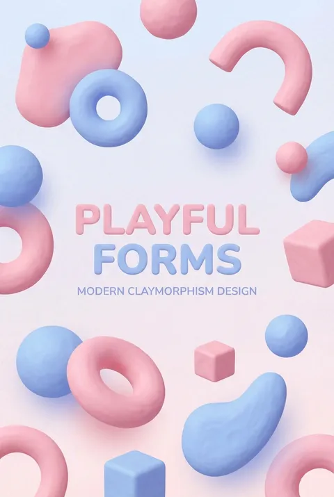
Claymorphism Posters
Claymorphism surfaced in digital design around 2021, evolving from the skeuomorphic revival and refined by designers like George Bohunicky and studios such as Zajno. Rooted in the belief that digital experiences benefit from the tactile warmth of handmade objects, its philosophy embraces softly rounded forms, gentle shadows, and subtly imperfect surfaces to evoke playfulness, comfort, and a sense of material presence within virtual spaces.
5 credits for new user registration. No credit card required.
Create Your Own Claymorphism Poster
Use our AI generator to design Claymorphism posters in seconds with full commercial rights.
Create Claymorphism Poster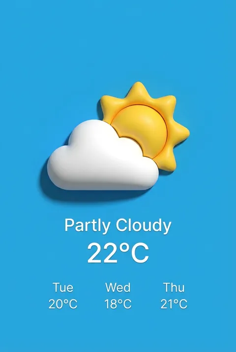
The Art of Claymorphism?
Turn Ideas into Art in Seconds
Describe Your Vision
Simply type your idea or concept for the poster.
Select Claymorphism Style
Our AI applies the specific Claymorphism design rules to your concept.
Customize & Download
Fine-tune colors, add text, and export in high-resolution.
Why Designers Choose Us
The professional choice for AI-generated design
Instant Speed
Results in < 30s
CC0 License
100% Commercial Use
Fully Editable
Layer-by-layer control
High Res
Print-ready quality
About Claymorphism Design
History of Claymorphism
Design Philosophy
Related Keywords
Claymorphism FAQ
Quick answers about designing Claymorphism posters.
What is claymorphism in UI design?
Claymorphism is a user interface design style that creates the appearance of soft, clay-like 3D elements. It combines pastel colors, rounded organic shapes, thick borders, and a distinctive double-shadow system to achieve a puffy, slightly squishy visual effect. The style brings digital interfaces into a more tactile, approachable realm while maintaining clarity and usability that earlier 3D trends like neumorphism sometimes lacked.
How does claymorphism create its distinctive 3D effect?
Rather than using simple light and dark outer shadows for extrusion, claymorphism employs two inner shadows (one dark, one light) combined with a darker outer shadow. This creates a soft floating effect that makes elements appear crafted from malleable materials. The shadow system, paired with generous corner rounding and subtle depth cues, gives interface elements a dimensional, touchable quality that feels approachable and engaging.
What color palettes work best for claymorphism?
Claymorphism thrives with minimalist color palettes that evoke organic warmth—typically pastel or muted tones that suggest softness and approachability. Interactive elements often feature brighter, more vivid colors that contrast helpfully against subtler backgrounds. This flexibility is a key advantage over neumorphism, which required elements to match background colors. The soft color choices reinforce the clay-like, moldable aesthetic while maintaining visual accessibility.
What are the best use cases for claymorphism design?
Claymorphism excels in gamified experiences where its playful dimensionality enhances interactivity and engagement. It works particularly well for landing pages focused on fun, friendly, or approachable brand positioning. The floating effect enables satisfying motion animations—like button presses that scale down as if being pushed into soft material. E-commerce and promotional contexts benefit from how this style makes interfaces feel more inviting and less intimidating.
Ready to design your next poster?
Create Claymorphism Poster