
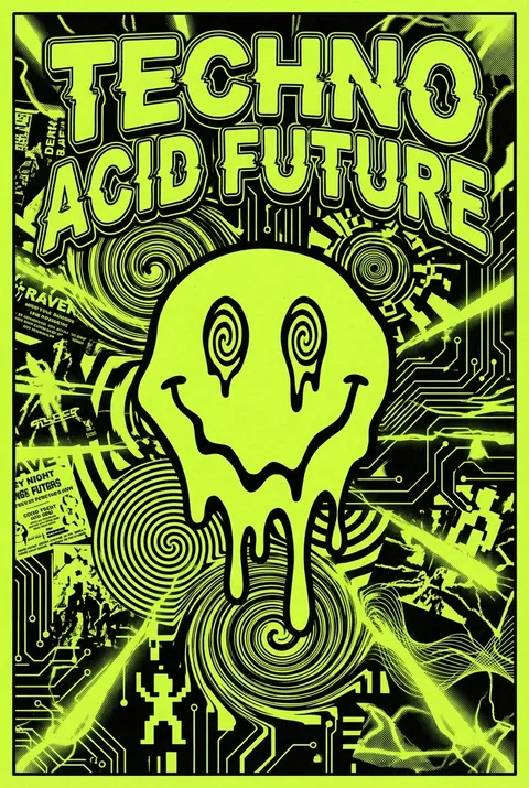
Acid Graphics Posters
Acid Graphics originated in late 1980s Britain amid the acid house and rave scenes, with studios like The Designers Republic shaping its identity through work for groundbreaking electronic musicians. The style’s philosophy rejects clarity and comfort, embracing distortion, visual overload, and anti-corporate rebellion as deliberate strategies. By cultivating aesthetic discomfort and complexity, Acid Graphics channels the raw, euphoric intensity of underground culture.
5 credits for new user registration. No credit card required.
Create Your Own Acid Graphics Poster
Use our AI generator to design Acid Graphics posters in seconds with full commercial rights.
Create Acid Graphics Poster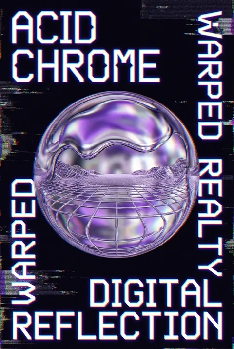
The Art of Acid Graphics?
Turn Ideas into Art in Seconds
Describe Your Vision
Simply type your idea or concept for the poster.
Select Acid Graphics Style
Our AI applies the specific Acid Graphics design rules to your concept.
Customize & Download
Fine-tune colors, add text, and export in high-resolution.
Why Designers Choose Us
The professional choice for AI-generated design
Instant Speed
Results in < 30s
CC0 License
100% Commercial Use
Fully Editable
Layer-by-layer control
High Res
Print-ready quality
About Acid Graphics Design
History of Acid Graphics
Design Philosophy
Acid Graphics FAQ
Quick answers about designing Acid Graphics posters.
What are acid graphics and why are they trending?
Acid graphics fuse Y2K graphics, AI-generated images and shimmering, gothic fonts, to name just a few elements. The result is visual designs that are exciting, even challenging at times—the direct opposite of clean-cut, almost barren 2010s minimalism. It can be understood as the graphic design world's underground adoption of the current wave of maximalism.
What is anti-design and how does it relate to acid graphics?
Imogen Hoefkens, art director of 99 Designs, defines anti-design as 'design that dismisses standard design principles, has colours that clash and type that's illegible.' Anti-designers are 'not seeking destruction, or ugliness for the sake of ugliness, but to offer an alternative to accepted design standards.' The combination of competing elements results in a kind of anti-design.
What visual elements define the Y2K aesthetic in acid graphics?
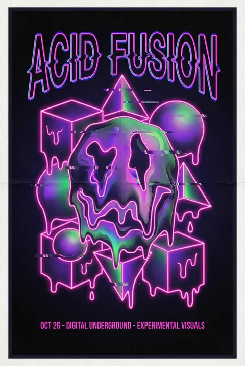
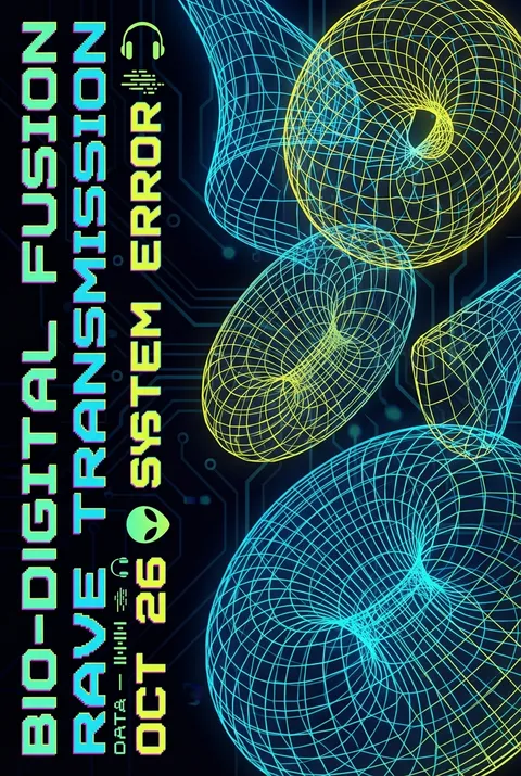
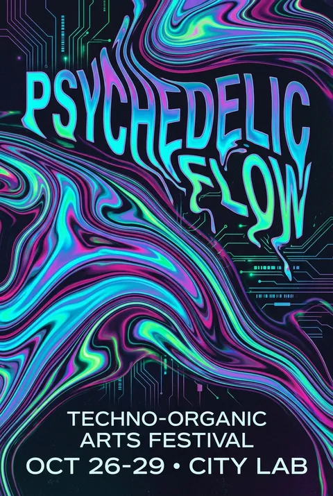
Key features include metallic and chrome textures with shiny, futuristic finishes; bold typography with pixelated fonts and stretched sans-serifs; abstract digital graphics like grids, glowing orbs, and 3D renders; and vivid colors with neon contrasts—electric blues, purples, and pinks against black backdrops. Bright colors such as lime, orange, and hot pink are often paired with sleek whites and metallic chrome.
How does Y2K typography differ from other styles?
Y2K's typography elements are bold, vibrant, and often chrome, three-dimensional, or gamified. They can also exhibit a liquefied texture. While not the most complex letterforms, they are hyper-exaggerated, sporting unconventional shapes, angles, and placements, taking inspiration from glitch art and computer-display language.
What role do digital imperfections play in acid graphics?
Embracing imperfection is a core element of the Y2K aesthetic. Glitch effects, pixelation, and distorted textures are used intentionally to create a sense of chaos and unpredictability, paying homage to the early days of digital technology. Key elements include iridescence with shimmering holographic textures and glitch art embracing digital imperfections and errors.
Ready to design your next poster?
Create Acid Graphics Poster