
How to Design a Movie Poster: Tips and Inspiration
Learn the essential principles of movie poster design — from composition and color to typography and genre conventions — with practical tips and real examples.

Key Takeaways
- •The standard movie poster (one-sheet) is 27x40 inches with a 2:3 aspect ratio
- •Composition should build a clear visual hierarchy: primary subject, title, credits
- •Color signals genre before the viewer reads a single word
- •Typography carries tone — serif suggests drama, sans-serif signals modernity
- •Studying the masters (Saul Bass, Drew Struzan) teaches more than any tutorial
On This Page
A great movie poster sells a film and stands on its own as graphic design. Whether you're making a poster for a short film, a class project, or just flexing your creative muscles, the principles behind effective poster design are worth knowing.
This guide covers the core elements — composition, color, typography, and genre conventions — so you can design movie posters that actually work.
The Standard Format
The modern one-sheet measures 27x40 inches (686x1016 mm). This has been the industry standard since around 1985, when it shrank by one inch from the original 27x41 format dating back to the lithographic press era.
That 2:3 aspect ratio shapes every layout decision. You're working with a tall, narrow canvas — ideal for a dominant central figure with the title below, or a vertical scene with text layered at the top and bottom.
Other historical sizes exist (half sheet at 22x28 inches, three sheet at 41x81 inches), but the one-sheet is what you'll find in theaters, on streaming platforms, and across social media today. If you're designing for digital, remember: the poster will be viewed at wildly different scales, from a cinema lobby to a phone thumbnail. Design for both.
Composition: Where the Eye Goes First
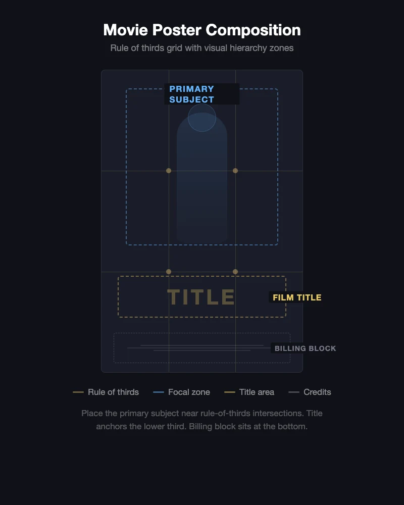
Movie poster composition boils down to one job: control where the viewer looks, and in what order.
Establish a focal point
Every effective poster has one clear primary subject — a character, a symbolic object, a dramatic scene. The viewer's eye lands there first, moves to the title, then picks up supporting details.
The rule of thirds works here the same way it does in photography. Place the primary subject at one of the intersection points of a 3x3 grid, and you create natural visual tension that holds attention.
Use scale to create hierarchy
The biggest element gets noticed first. In movie posters, that's almost always the main character or a symbolic image. The title comes second in size. The billing block (that dense strip of credits at the bottom) stays deliberately small — it needs to be there, but it shouldn't compete.
Negative space isn't wasted space
Some of the most iconic movie posters use negative space as a design element. A lone figure against an empty background communicates isolation. A stark silhouette against white space builds tension. Don't feel compelled to fill every corner.
Diagonal composition
Action films regularly use diagonal lines to suggest movement and energy. Tilting the main subject off-axis or arranging elements along a diagonal makes the poster feel dynamic rather than static.
Color: Setting the Mood Before a Word Is Read
Color is the fastest emotional signal on a movie poster. Viewers register the palette before they read the title, and that first impression sets genre expectations.
The orange-and-blue phenomenon
If you've noticed that a huge number of movie posters use the same two colors, you're not imagining it. Orange and blue (often called teal and orange) are complementary colors on the color wheel, creating maximum visual contrast. The practical reason it works: human skin tones sit on the orange axis, so a face against a blue background pops naturally.
This palette dominates action and sci-fi posters. It's effective, but it's overused — worth knowing if you want your poster to stand out.
Genre color conventions
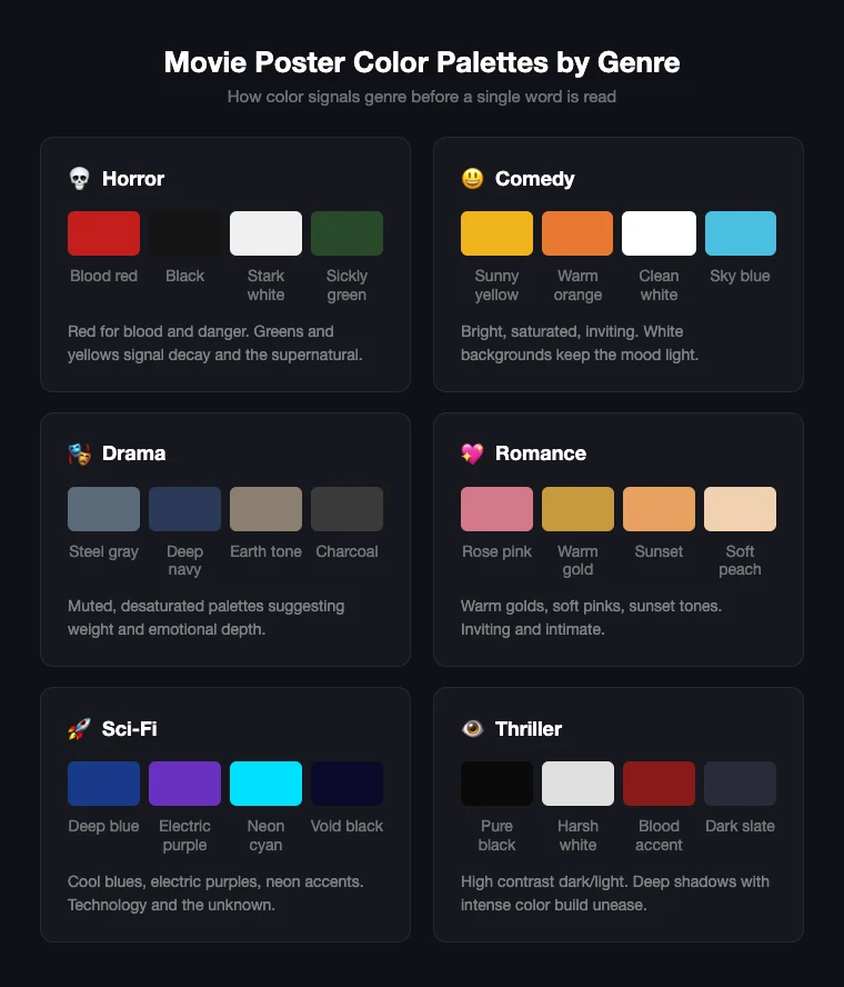
Different genres have built their own color languages over decades:
- Horror: Red, black, and white dominate. Red signals blood and danger. Icy blues and sickly greens create alienation for supernatural stories.
- Comedy: Bright yellows, oranges, and warm tones. White backgrounds keep things light and approachable.
- Drama: Muted earth tones, deep blues, grays. The palette suggests weight and seriousness.
- Romance: Warm golds, soft pinks, sunset tones. Inviting and intimate.
- Sci-fi: Cool blues, electric purples, neon accents. Dark backgrounds with bright highlights suggest technology and the unknown.
- Thriller: High contrast between dark and light. Deep shadows with small areas of intense color build unease.
These are conventions, not rules. Breaking a genre's expected palette can be deliberate — a comedy with a dark palette signals dark comedy.
Limit your palette
Effective movie posters typically use 2-3 dominant colors plus neutrals. A tighter palette hits harder than a rainbow of competing hues.
Typography: The Voice of the Poster
The font on a movie poster isn't just carrying the title — it's setting the tone. Typography tells the viewer what kind of film this is before they process the words.
Matching type to tone
- Serif fonts (Times, Garamond, custom serifs): Tradition, drama, prestige. Common in period pieces and awards-season dramas.
- Sans-serif fonts (Helvetica, Futura, geometric sans): Modernity, cleanliness, sci-fi coolness. Thrillers and minimalist designs.
- Display and decorative fonts: Heavy stylistic weight. Hand-drawn lettering for indie films. Distressed fonts signal horror instantly.
- Custom lettering: The most memorable titles use custom-designed letterforms inseparable from the film's identity — the Star Wars logo, the Jurassic Park treatment.
Three text layers
A movie poster typically has:
- Title: The dominant text. Legible at a distance and at thumbnail scale.
- Tagline: Optional. A short, punchy line that adds context or intrigue.
- Billing block: The dense credits at the bottom, using condensed sans-serif fonts (Trade Gothic, Helvetica Compressed, Univers Condensed) with contractual formatting.
The title usually sits in the lower third, anchoring the composition. But no absolute rules — some iconic posters put the title at the top, embed it in the image, or make it the dominant visual element.
Learning from the Masters
Two designers defined the visual language of movie posters across different eras. Studying their work teaches more than any tutorial.
Saul Bass: The power of reduction
Saul Bass changed everything in 1955 with his poster for The Man with the Golden Arm. Before Bass, movie posters depicted literal scenes or character portraits. He stripped that away, replacing it with symbolic, geometric designs that captured a film's emotional core.
His poster for Vertigo (1958) — a stylized figure pulled into a spiral vortex — communicates anxiety and disorientation without showing a single scene. His work for Hitchcock, Preminger, Kubrick, and Scorsese proved that abstraction could sell films more effectively than realism.
Bass was influenced by the Bauhaus movement: clean geometric forms, no decorative excess, every element serving a purpose. That philosophy remains the foundation of strong poster design.
Takeaway from Bass: Distill the film down to one visual metaphor. If you can communicate the story's emotional center with a single shape or symbol, you've got a strong poster.
Drew Struzan: The art of the painted epic
Where Bass simplified, Drew Struzan maximized. His airbrushed illustrations for Star Wars, Indiana Jones, Back to the Future, Blade Runner, and Harry Potter defined the look of blockbuster cinema for decades. Struzan created over 150 film posters, and his work became so closely tied to certain franchises that the posters are cultural artifacts.
Struzan combined photorealistic character portraits with dramatic lighting, layered composition, and epic scale. You could look at a Struzan one-sheet and sense the adventure, danger, and stakes before seeing a frame of the film.
Takeaway from Struzan: Character expression and lighting sell emotion. A well-rendered face with dramatic light and shadow can carry an entire poster.
Genre-Specific Design Patterns
Each genre has developed visual shorthand that audiences recognize instantly. Knowing these patterns helps you work within them — or subvert them.
Action and adventure
- Large-scale character in a dynamic pose
- Explosions or environmental destruction in the background
- Warm palette (oranges, reds) with high contrast
- Bold, uppercase title treatment
- Diagonal composition for energy
Horror
- Dark, limited palette with strategic red
- Partially hidden or obscured subjects
- Isolated figures, empty environments, claustrophobic framing
- Distressed or hand-drawn typography
- Negative space builds tension
Comedy
- Bright, clean backgrounds (often white or solid)
- Characters in humorous poses or expressions
- Casual, playful typography
- Warm, inviting palette
- Simple composition
Drama and prestige
- Muted, sophisticated palette
- Close-up character portraits with emotional expressions
- Elegant serif or refined sans-serif type
- Restrained composition with breathing room
- Minimal elements — quality over quantity
Sci-fi and fantasy
- Dark backgrounds with dramatic lighting
- Bold use of scale — vast landscapes, towering structures
- Futuristic or stylized type
- Cool palette (blues, purples) with neon accents
- Often symmetrical or centrally composed
Current Trends in Movie Poster Design
After years of the "floating heads" approach — photoshopped celebrity faces over a generic background — there's a visible push toward more thoughtful designs, especially in independent film (verified March 2026).
Bold minimalism
Clean compositions with limited elements, stronger contrast, and bigger typography. One powerful statement instead of trying to communicate everything.
Illustrated and hand-drawn revival
Hand-made posters are making a comeback — retro analog aesthetics, VHS-inspired textures, letterpress typography. The appeal is authenticity: these posters feel made by a human, not assembled from stock assets.
Typography as hero
Some of the most striking recent posters let the title treatment dominate the entire design, using custom lettering as the primary visual rather than character imagery.
AI as a design tool
AI-assisted workflows are entering poster design, primarily for textures, concept exploration, and rapid iteration rather than replacing creative direction (verified March 2026).
Practical Tips for Your Own Poster
-
Start with the story, not the software. What's the one-sentence emotional core? Your poster should communicate that feeling visually.
-
Thumbnail test early. Scale your work-in-progress to phone-screen size. If the composition and title aren't clear at that scale, simplify.
-
Pick a focal point and commit. One dominant visual element. Not three. One.
-
Let color set the genre. Before adding text, your palette should already hint at whether this is a thriller, comedy, or drama.
-
Treat type as design, not afterthought. Font choice and placement should feel intentional.
-
Study real posters. Browse the 99designs movie poster gallery or CreativeBloq's monthly roundups to see what's working now.
-
Respect the billing block. The condensed-font credit strip at the bottom is part of the visual vocabulary of professional movie posters.
Want to experiment with different styles? poster.sh's movie poster category has AI-generated examples across dozens of visual approaches — from cinematic lighting to film grain textures — that you can use as starting points.
Bottom Line
Most strong movie posters still win on the same fundamentals: one focal point, type that carries tone, and a color system that signals genre quickly. That remains true as of April 14, 2026, but the right balance changes when the poster has to work at streaming-thumbnail scale, franchise marketing rules override elegance, or the campaign needs to foreground cast recognition over pure design logic.
Frequently Asked Questions
- What size should a movie poster be?
- The standard one-sheet is 27x40 inches (686x1016 mm) with a 2:3 aspect ratio, the theatrical standard since the mid-1980s. For digital use, maintain the 2:3 ratio at a resolution appropriate for your platform.
- What makes a movie poster look professional?
- Three things: a clear visual hierarchy (one focal point, then title, then credits), intentional typography matching the film's tone, and a billing block at the bottom. A limited, cohesive color palette ties it together.
- Can I design a movie poster without illustration skills?
- Yes. Many effective posters rely on photography, typography, and graphic design rather than hand illustration. Composition and color choices matter more than drawing ability. AI tools can also help you [explore visual concepts](/movie-posters) to build on. --- *Method note: Design principles and historical facts sourced from established design publications and industry references. Genre conventions based on documented patterns across major film poster design. Trend observations verified March 2026. See fact-check.md for the full source registry.*
Create Your Own Movie Poster
Choose a cinematic style, describe your vision, and generate a movie poster in seconds with AI.
Try the Movie Poster Generator

