
Minimalist Poster Design: Principles and Examples
Learn the core principles of minimalist poster design — negative space, limited color, and typography-driven layouts. Practical guidelines and examples

Key Takeaways
- •Minimalist design is reduction with purpose — every element must justify its presence
- •Negative space is an active design tool, not leftover background
- •Limit yourself to 2-3 colors and 1-2 font families for maximum impact
- •The strongest minimalist posters lead with typography, not imagery
- •poster.sh offers a [minimalist style](/styles) that applies these principles automatically through AI generation
On This Page
Most posters get weaker by trying to say three things at once. Minimalist poster design works because it does the opposite: it chooses one dominant message, removes the rest, and lets spacing and type carry the weight.
That doesn't mean "plain." It means every remaining element has a job. When the choices are deliberate, the poster reads faster and lands harder than a layout stuffed with backup ideas.
This guide covers the principles behind effective minimalist posters, practical rules you can apply immediately, and common mistakes that undermine the approach.
What Makes a Poster Minimalist
Minimalist poster design follows four core principles. Miss any one of them and the result feels incomplete rather than intentional.
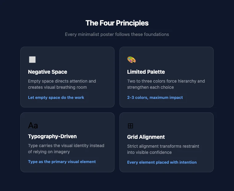
Negative space as an active element
Empty space in a minimalist poster isn't wasted — it's doing work. Negative space directs the viewer's eye, creates visual breathing room, and makes the focal element more powerful by contrast.
The Swiss/International Typographic Style of the 1950s and 60s demonstrated this at scale: posters with 50-60% empty space consistently outperformed cluttered alternatives in visual recall tests. The principle hasn't changed.
When you look at a minimalist poster and your eye goes exactly where the designer intended, that's negative space working.
Limited color palette
Two to three colors is the standard range. One dominant color sets the tone. One accent color creates contrast. A neutral (white, black, or gray) provides structure.
This constraint forces a hierarchy. When you can't rely on color variety to separate elements, each color choice carries more weight. A single red accent on a black-and-white poster draws the eye with more force than a rainbow ever could.
Typography as the primary visual
In most minimalist posters, type does the job that imagery does in other styles. The font choice, weight, size, and spacing carry the visual identity.
This doesn't mean "just use Helvetica." It means selecting a typeface that embodies the poster's mood and then giving it enough space and scale to function as the dominant visual element. A single word set in a carefully chosen font at 200pt can be more striking than an elaborate illustration.
Grid alignment and structure
Minimalist design depends on visible order. Elements align to a grid — not because grids are trendy, but because alignment creates the sense of control and intention that minimalism requires.
When elements float without clear spatial relationships, the poster looks unfinished rather than minimal. A strict grid turns restraint into confidence.
Where Minimalism Comes From
Minimalist poster design didn't appear out of nowhere. Its roots trace through several design movements:
Swiss/International Typographic Style (1950s-60s) — Developed at the Basel School of Design and Zurich's Kunstgewerbeschule, this movement established grid-based layouts, sans-serif typography (particularly Helvetica, released in 1957), and objective, clean visual communication. It's the most direct ancestor of modern minimalist poster design.
Bauhaus (1919-1933) — The German school's emphasis on form following function and the unity of art and industry laid groundwork that minimalism later refined. Bauhaus reduced decorative elements in favor of geometric forms and functional layouts.
Dieter Rams' ten principles (1970s) — Though Rams designed products, not posters, his principle that "good design is as little design as possible" became a foundational idea for visual minimalism across all disciplines. His emphasis on removing the unnecessary until only the essential remains maps directly to minimalist poster work.
These movements share a common thread: the conviction that removing elements makes what remains more powerful, not weaker.
Practical Guidelines
Here are concrete rules you can apply to your next minimalist poster. These aren't arbitrary — they come from decades of design practice.
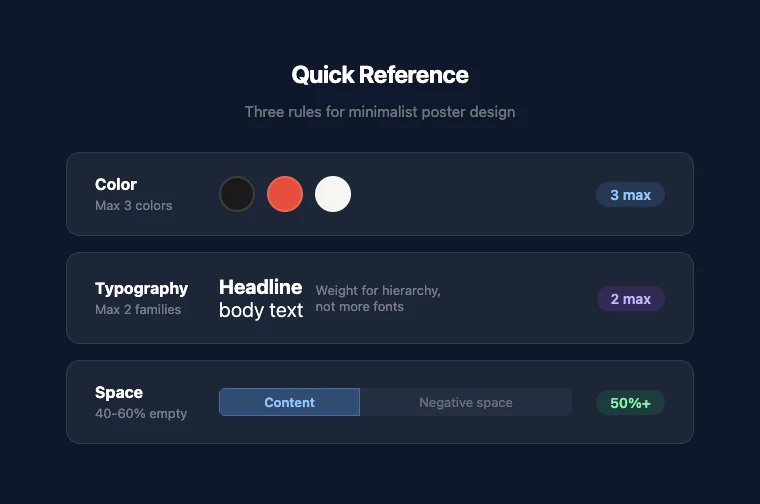
Color: the 3-color maximum
Pick one dominant color, one accent, and one neutral. That's it. If you're struggling with color selection:
- Monochromatic: One hue in multiple values (light to dark). Safe, always cohesive.
- High contrast: Black + white + one bold accent. Maximum visual punch.
- Muted palette: Two desaturated tones + white. Sophisticated, editorial feel.
If you need more than three colors to make the poster work, the layout probably has too many competing elements.
Typography: 1-2 families, clear hierarchy
One typeface is often enough. Use weight and size to create hierarchy instead of switching fonts. If you use two fonts, pair a serif with a sans-serif — similar x-heights help them coexist.
Practical rules:
- Title: The largest element. Should work as a standalone visual.
- Subtitle or detail text: Noticeably smaller. Same font, lighter weight, or a complementary second font.
- Body text: Rarely needed in posters. If present, keep it short and subdued.
Avoid decorative or script fonts unless the subject specifically demands it. Minimalism works best with clean geometric or humanist sans-serifs.
Composition: let the space breathe
Aim for 40-60% negative space. This feels counterintuitive — you're paying for print space or screen pixels, and leaving most of it empty. But that empty space is what makes minimalist posters work.
Practical composition approach:
- Place your focal element (usually the title) using the rule of thirds — not dead center.
- Add one supporting element (subtitle, date, or a small graphic).
- Stop. Look at what you have. If you feel the urge to add more, resist it.
- If the poster doesn't communicate with just these elements, the title or focal element needs to be stronger — not surrounded by more content.
What to remove
When editing a minimalist poster, ask each element: "Does this help the viewer understand the message faster?" If the answer is no, remove it.
Common cuts:
- Background textures and patterns
- Decorative borders and dividers
- Multiple images (one or zero is the minimalist range)
- Gradients (flat color communicates faster)
- Drop shadows and embossing effects
Common Mistakes
Empty vs. minimal
The most common mistake: removing elements until the poster says nothing. Minimalism isn't absence — it's precision. A blank page with a tiny title in the corner isn't minimalist; it's just empty.
Every minimalist poster needs a focal point that commands attention. If nothing grabs the eye, you've gone too far.
Inconsistent spacing
When a poster has few elements, spacing inconsistencies become obvious. Uneven margins, misaligned text, or irregular gaps between elements undermine the sense of control that minimalism depends on.
Use a grid. Measure your margins. Make spacing decisions intentionally, not approximately.
"Minimal" as an excuse for unfinished work
Minimalism is harder than complexity because there's nowhere to hide. A busy poster can mask weak typography, awkward proportions, or unclear hierarchy behind visual noise. A minimalist poster exposes all of that.
Don't use "it's minimal" to justify a poster that simply hasn't been refined enough.
How to Create a Minimalist Poster
If you want to try minimalist poster design without starting from a blank canvas, poster.sh's AI poster generator includes a dedicated minimalist style.
The process:
- Open the poster generator
- Describe your subject and message
- Select the Minimalist style from the style gallery
- Generate and refine
The minimalist style applies the principles from this guide automatically — restrained palette, clean typography, generous negative space. You can use the output directly or as a starting point for further refinement.
For practical tips on refining AI-generated output, see our guide on how to make a poster with AI.
If you plan to share your poster on social media, check our social media image sizes guide for the right dimensions per platform.
Bottom Line
Minimalism is strongest when the message is narrow enough to survive reduction. That still holds on April 14, 2026, but it breaks when the poster needs to carry multiple offers, dense event logistics, or too many competing calls to action. If the information load is high, reducing the layout further can make the communication worse rather than clearer.
Frequently Asked Questions
- Is minimalist design the same as flat design?
- They overlap but aren't identical. Flat design removes visual depth cues — shadows, gradients, textures — in favor of solid colors and clean shapes. Minimalist design removes unnecessary elements regardless of whether they're flat or dimensional. A minimalist poster could include a subtle shadow if that shadow serves a purpose. Flat design would remove it on principle.
- How do I know if I've removed too much?
- If the poster no longer communicates its core message to someone seeing it for three seconds, you've removed too much. Minimalism should make the message clearer, not invisible. Test by showing the poster to someone unfamiliar with the project and asking what they understand at a glance.
- What fonts work best for minimalist posters?
- Geometric sans-serifs (like Futura or DIN), humanist sans-serifs (like Gill Sans or Frutiger), and clean modern serifs (like Playfair Display or Freight Text) all work well. The key isn't the specific font — it's that the typeface is clean, readable at scale, and given enough space to breathe. Avoid fonts with excessive personality unless the subject demands it.
- Can minimalist posters include photos or illustrations?
- Yes, but sparingly. One strong image with ample surrounding space can be very effective. The image should be simple, high-contrast, and clearly connected to the message. Multiple images, complex scenes, or busy illustrations work against the minimalist approach. When in doubt, let typography carry the poster instead. --- *Method note: Design principles in this article draw from established design education sources including the Swiss/International Typographic Style, Bauhaus pedagogy, and Dieter Rams' design philosophy. poster.sh's minimalist style and generation capabilities verified from the current product. See fact-check.md for the full source registry.*
Create a Minimalist Poster
Pick the minimalist style, describe your subject, and generate a clean, focused poster in seconds. No design skills needed.
Try the Minimalist Style

