
50,000 张海报已创建
棕褐色调 风格海报
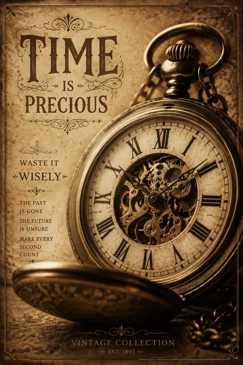
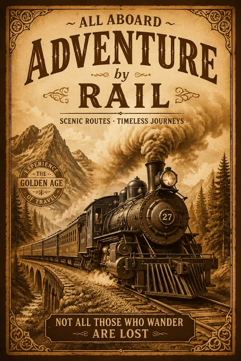
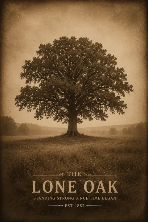
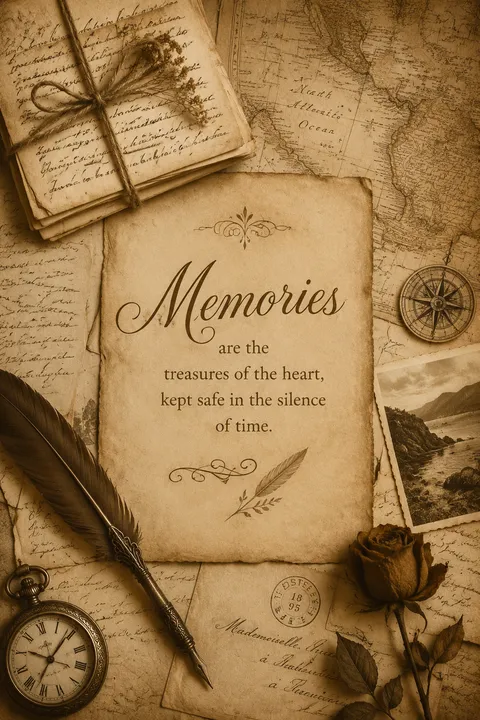
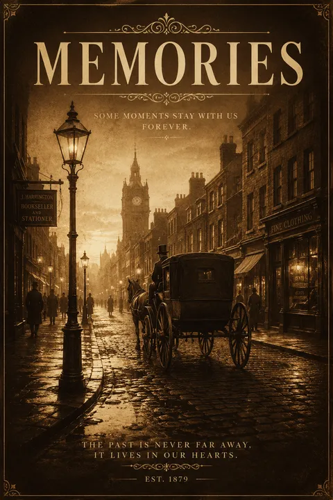
棕褐色调最早出现在19世纪的摄影领域,既是一种美学尝试,也是为了延长照片保存时间。其设计理念强调色彩作为时间印记的作用——温暖的棕褐色调能迅速唤起人们对记忆和历史的联想,将普通影像转化为具有年代感的视觉档案。这种风格通过色彩与质感的巧妙运用,赋予画面怀旧气息,有意识地营造出时光流逝的美感。
新用户注册赠送5积分,无需信用卡
商用授权随时取消
风格指南
探索 棕褐色调?
棕褐色调最早出现在19世纪的摄影领域,既是一种美学尝试,也是为了延长照片保存时间。其设计理念强调色彩作为时间印记的作用——温暖的棕褐色调能迅速唤起人们对记忆和历史的联想,将普通影像转化为具有年代感的视觉档案。这种风格通过色彩与质感的巧妙运用,赋予画面怀旧气息,有意识地营造出时光流逝的美感。
如何创建 棕褐色调 海报
1
选择您的风格
浏览我们精选的视觉风格,选择最能体现您创意方向的一款。
2
描述您的 棕褐色调 创意
输入您想要的画面描述。我们的 AI 会分析并融合 棕褐色调 风格的精髓。
3
生成并下载
让 AI 发挥魔力。几秒后即可获得高分辨率图片。
为什么选择我们的生成器
专业级功能,人人可用
秒速生成
无需等待。AI 技术让您瞬间获得结果。
商用授权
免费用于个人和商业项目,无隐藏费用。
完全可控
调整提示词、风格和参数,精准实现您的创意。
高清输出
可用于印刷的分辨率,细节清晰锐利。
棕褐色调 风格指南
关于 棕褐色调 设计
棕褐色调最早出现在19世纪的摄影领域,既是一种美学尝试,也是为了延长照片保存时间。其设计理念强调色彩作为时间印记的作用——温暖的棕褐色调能迅速唤起人们对记忆和历史的联想,将普通影像转化为具有年代感的视觉档案。这种风格通过色彩与质感的巧妙运用,赋予画面怀旧气息,有意识地营造出时光流逝的美感。
棕褐色调的历史
棕褐色调源于19世纪的摄影,既是审美选择也是一种保存技术。该工艺将摄影印相中的金属银替换为硫化银,产生温暖的棕色调并延长了影像的保存寿命。其名称来自以乌贼(学名 Sepia)的墨汁作为最初颜料,棕褐色调逐渐与维多利亚和爱德华时期的肖像摄影联系在一起。
随着摄影技术的发展,棕褐色调从常用做法中淡出——彩色和黑白等替代方案提供了更大的灵活性。然而,这种视觉效果与年代感和历史感的关联,使其在事后应用中依然具有价值。数码摄影则使即时的棕褐滤镜成为可能,将当代影像转化为看似历史性的资料。
在设计中,棕褐色美学如今成为一种即时的历史标识。特定的棕色调会立刻暗示年代感、传承以及时间流逝。这一风格常出现在历史纪录片、遗产品牌塑造、古董商的宣传资料,以及任何希望通过摄影语汇唤起过去的场景中。
设计哲学
棕褐色海报设计通过色彩来标示时间。这一理念认为,温暖的棕褐色调带有直接的时间联想——棕褐影像会被解读为历史性的,无论其实际年代如何。色彩成为叙事手段,把内容置于过去。
核心视觉要素包括典型的温暖棕褐色调、降低的对比度以暗示陈旧的印相、边缘处细微的暗角,以及整体处理唤起早期摄影工艺的质感。情感基调为怀旧、历史感与温润的陈旧氛围——棕褐色设计即时营造出一种传承感,表明单凭视觉处理便能将内容带回过去。
棕褐色调 常见问题
快速了解 棕褐色调 风格海报创作的关键细节。
什么是海报设计中的复古褐色风格?
复古褐色风格采用温暖的棕褐色调,模拟老照片的效果,营造怀旧、古朴的氛围。这种单色处理方式源自早期摄影的化学工艺,能够唤起人们对历史时期、记忆和时光流逝的感怀。
复古褐色能创造怎样的视觉效果?
复古褐色能营造温暖怀旧的氛围,暗示年代感和历史时期,通过统一的色调处理将不同的图像融为一体,并唤起人们对老照片的情感共鸣。棕褐色调比纯黑白更温暖,也更具浪漫气息。
如何创造出色的复古褐色效果?
出色的复古褐色效果需要选择恰当的棕褐色调(既不能偏橙也不能偏灰),根据想要的情绪调整对比度,并可能需要添加配套的做旧效果,如暗角、纹理或柔焦处理。
什么时候应该在海报设计中使用复古褐色风格?
复古褐色风格适合历史主题、怀旧内容、纪念材料、西部题材,以及需要以陈旧温暖美感增强吸引力的场景。这种风格适用于任何想要唤起记忆、历史和老照片情感特质的设计。
准备好设计你的下一张海报了吗?
开始创作