
50,000 张海报已创建
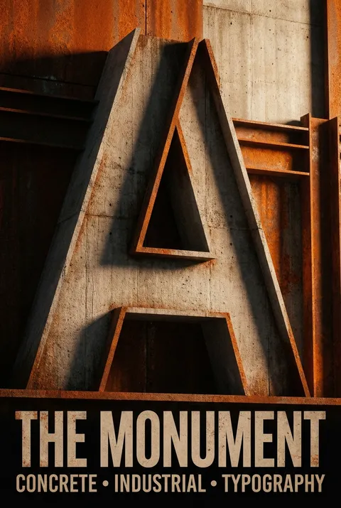
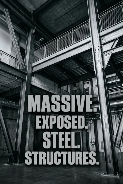
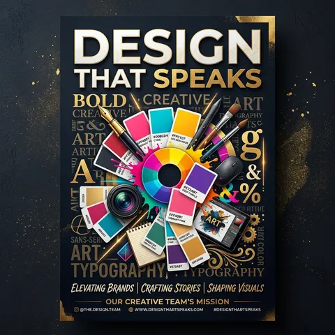
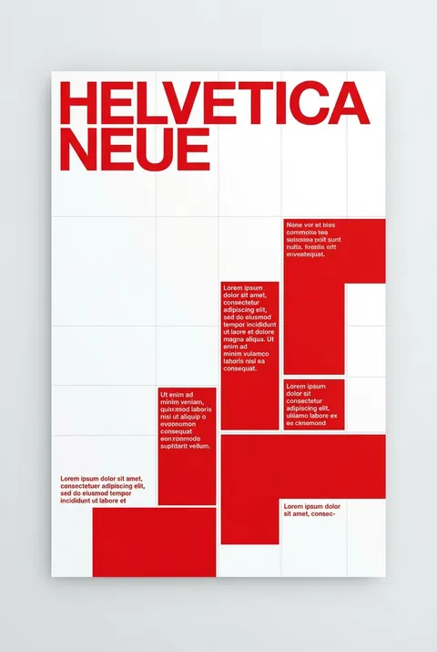
大胆字体 风格海报
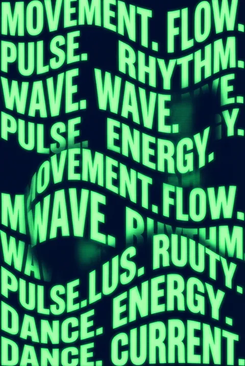
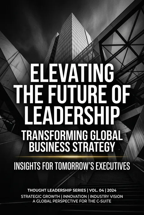
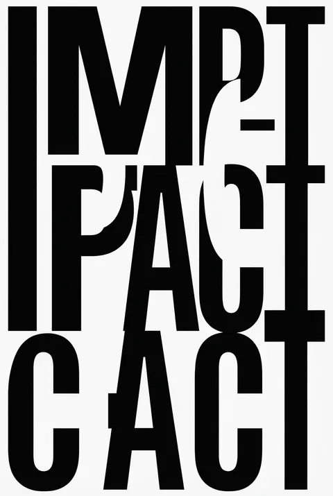
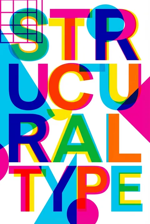
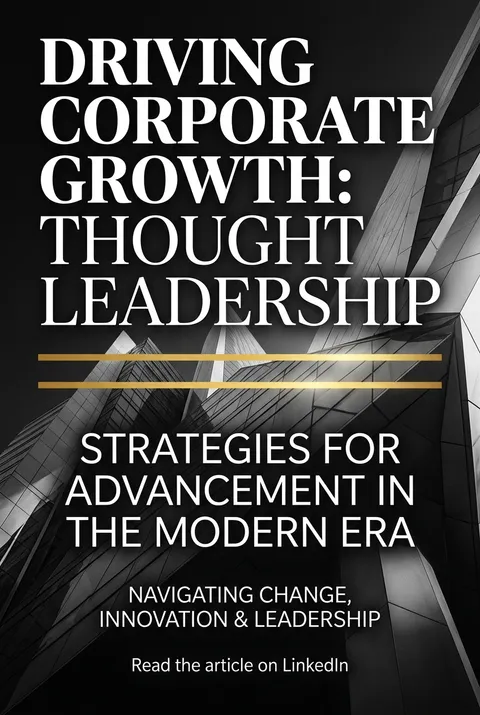
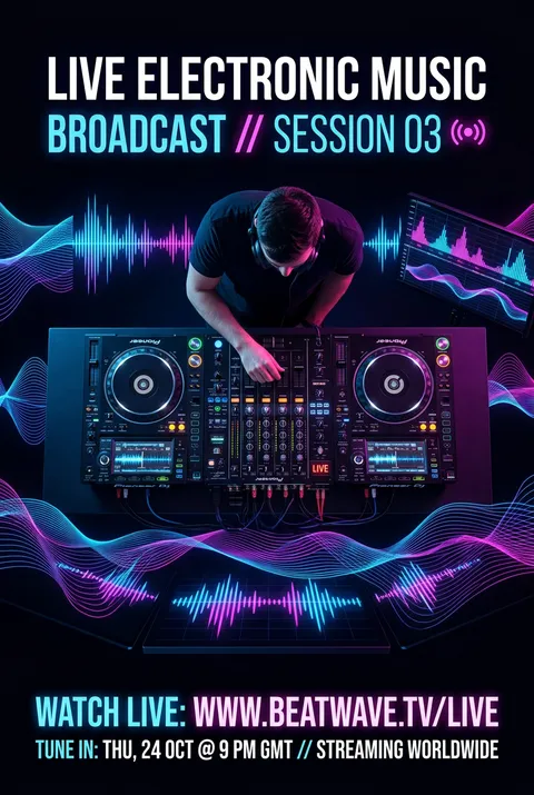
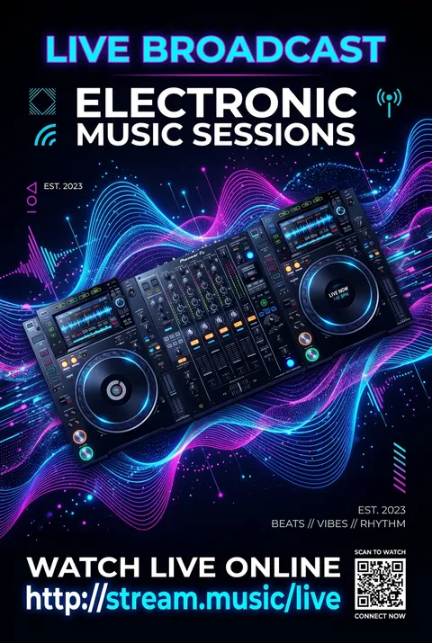
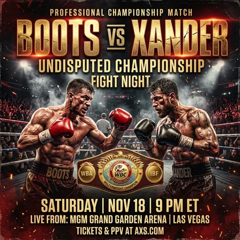
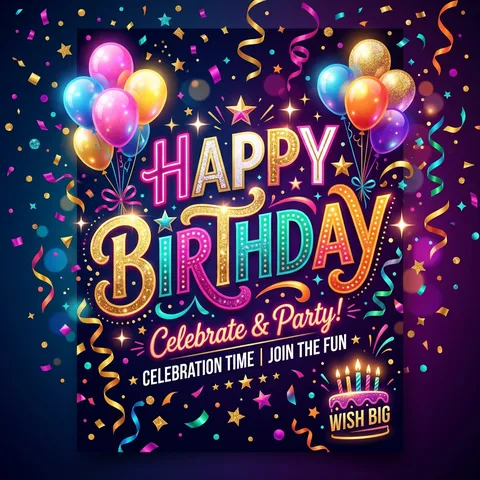
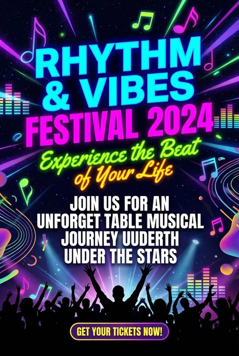
在线创建大胆字体海报,使用超大字号、高对比版式和文字视觉艺术模板,让标题、标语和活动信息成为海报主角。
新用户注册赠送5积分,无需信用卡
商用授权随时取消

风格指南
探索 大胆字体?
大胆字体风格源于20世纪先锋艺术运动,从Marinetti的未来主义实验、包豪斯的几何严谨,到瑞士设计大师和后现代创新者颠覆规则的宏大排版。其设计理念强调字体本身的视觉张力——通过比例、节奏与空间关系,将版面转化为纯粹表达的舞台,仅凭字体就能传递情感与思想。


如何创建 大胆字体 海报
1
选择您的风格
浏览我们精选的视觉风格,选择最能体现您创意方向的一款。
2
描述您的 大胆字体 创意
输入您想要的画面描述。我们的 AI 会分析并融合 大胆字体 风格的精髓。
3
生成并下载
让 AI 发挥魔力。几秒后即可获得高分辨率图片。
为什么选择我们的生成器
专业级功能,人人可用
秒速生成
无需等待。AI 技术让您瞬间获得结果。
商用授权
免费用于个人和商业项目,无隐藏费用。
完全可控
调整提示词、风格和参数,精准实现您的创意。
高清输出
可用于印刷的分辨率,细节清晰锐利。
大胆字体 风格指南
关于 大胆字体 设计
在线创建大胆字体海报,使用超大字号、高对比版式和文字视觉艺术模板,让标题、标语和活动信息成为海报主角。
大胆字体的历史
在整个20世纪,排版从辅助元素向主要图形手段的提升逐步演进。早期先例包括未来主义者Filippo Marinetti在1909年提出的“words in freedom”,文本以动态的编排在页面上爆发式扩散,以及Raoul Hausmann和Kurt Schwitters的达达主义排版实验。包豪斯学派的Herbert Bayer将排版剥离至几何的本质,而Jan Tschichold在1928年的《Die Neue Typographie》则将现代主义原则予以规范化。
20世纪50至60年代的瑞士国际风格带来了严谨而大胆的表达——像Armin Hofmann这样的设计师创作的海报中,字体通过尺度与留白获得了宏大的存在感。Wolfgang Weingart在1970至80年代的“New Wave”排版打破了这些规则,堆叠、重叠并扭曲字母,将其转化为原始的视觉能量。
当代的大胆排版既继承了这些传统,又对新的语境作出反应。像Paula Scher为The Public Theater创造了爆发性的字体识别,David Carson在Ray Gun杂志中故意采用“不可读”的版面并引发争议,这些设计推动排版朝向纯粹的视觉表达发展。如今,大胆排版出现在从品牌识别到抗议图像的各类场景中,证明字母本身就能承载全部所需的视觉力量。
设计哲学
大胆排版海报设计把字形首先视为视觉形体,其次才是语言符号。
这一理念认为排版本身具有内在的美学力量——字重、比例、节奏与留白能够在不依赖语言内容的情况下产生情感冲击。
核心原则包括极端的尺度变化、有意的层次构建(或有意破坏层次)、对间距与字形关系的精细把控,以及将海报表面视为构图场域而非供阅读的平面。其情感表达从权威性的宣告到表现性的混沌皆有,其统一点在于坚持让排版承担全部视觉重担。
大胆字体 常见问题
快速了解 大胆字体 风格海报创作的关键细节。
粗体字趋势是如何发展起来的?
粗体字趋势是从极简主义风格中发展而来的。这种设计中字体与图形元素处于平等地位,甚至主导整个构图。粗体字向用户传达了确定性和信心。
粗体字在网页设计中如何应用?
网页设计是使用粗体字的最早领域之一,结合高质量的真实摄影作品,在极短的时间内用很少的大型文字,给用户留下深刻的印象。在海报设计中大胆的字体一直是主流风格。
版式设计中如何规范字体粗细?
越粗的字通常是用来表达越重要的内容,比如一级标题通常都会选择粗体字,副标题选择低一级的字。正文内容则又比副标题降低一个粗度。选择什么样的字号是基于阅读距离。
黑体字在设计中有什么特点?
黑体字浑厚有力,结构严谨、笔划单纯、朴素大方、富有现代感。由于其显目突出的特征,主要用于画面感较为强烈、需要突出强调信息的设计,比如标题大多选用黑体。
粗体字在包装和书籍设计中如何使用?
包装上的粗体字可以直接告诉潜在客户品牌是什么。随着电子阅读器的兴起,粗体字开始越来越多地出现在书籍封面上,用于吸引读者注意力和传达书籍主题。
准备好设计你的下一张海报了吗?
开始创作