
光环渐变 风格海报
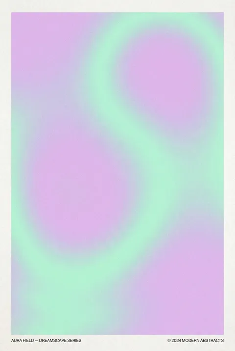
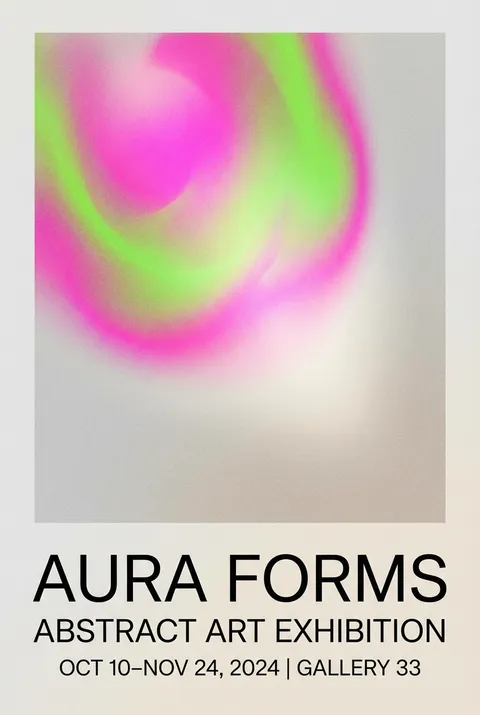
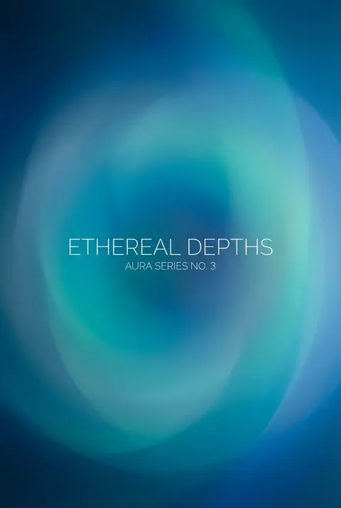
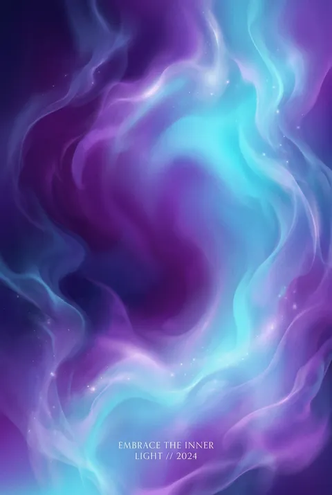
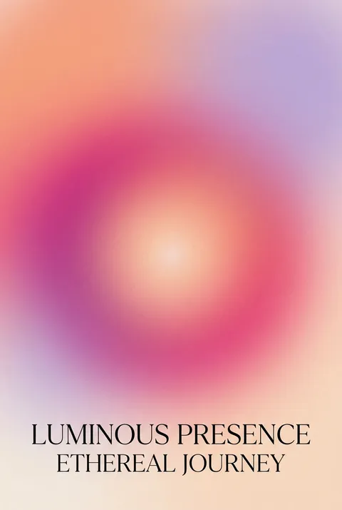
光环渐变(Aura Gradient)起源于2010年代末,诞生在身心健康视觉文化、Instagram美学与Apple界面设计不断演变的交汇点。其设计理念强调营造沉浸式氛围,通过柔和的色彩过渡和流动的光感,唤起宁静与超然的体验。光环渐变以视觉的宁静邀请人们在数字喧嚣中驻足,感受内在能量场和灵性摄影所带来的平和与治愈。
新用户注册赠送5积分,无需信用卡
探索 光环渐变?
如何创建 光环渐变 海报
选择您的风格
浏览我们精选的视觉风格,选择最能体现您创意方向的一款。
描述您的 光环渐变 创意
输入您想要的画面描述。我们的 AI 会分析并融合 光环渐变 风格的精髓。
生成并下载
让 AI 发挥魔力。几秒后即可获得高分辨率图片。
为什么选择我们的生成器
专业级功能,人人可用
秒速生成
无需等待。AI 技术让您瞬间获得结果。
商用授权
免费用于个人和商业项目,无隐藏费用。
完全可控
调整提示词、风格和参数,精准实现您的创意。
高清输出
可用于印刷的分辨率,细节清晰锐利。
关于 光环渐变 设计
光环渐变的历史
设计哲学
光环渐变 常见问题
快速了解 光环渐变 风格海报创作的关键细节。
如何设计极光风UI效果?
将富有创意的「极光风」背景与UI组件混合使用,是确保UI功能元素可用性和界面整体可访问性的最佳呈现方式。设计极光风效果可以选用几个大小不一的几何图形,然后对其进行模糊,并混合在一起创建规则的渐变。
极光风背景如何与UI组件结合?
也可以将多个渐变填充混合一起,并且都是从中心向边缘的方向,同时降低它们的不透明度。如果手头上已有一些相对柔和色彩过渡的照片,可以基于照片采用Glassmorphism实现模糊效果,将模糊程度提到最大以获得自然效果。
2025年渐变设计有什么新趋势?
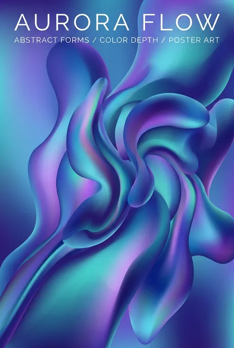
渐变形状正在以微妙的扭曲卷土重来。这种趋势将有机、摇晃的形式与柔和的渐变和颗粒状纹理相结合,让人想起90年代怀旧的海报设计。渐变与轻微模糊和噪点效果的混合使这些形状具有梦幻、复古的感觉。
渐变设计在不同领域如何应用?
可以将渐变与干净的无衬线字体配对,以获得平衡、现代的外观。这种趋势避免了过去过度的渐变,而是将它们推到背景中以获得微妙的复杂性。鲜明的色彩和渐变效果在Logo设计中可能会继续占据重要地位。
渐变在UI/UX设计中有什么作用?
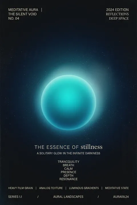
渐变本身不再受到关注,但它们现在为界面带来了深度和空间感。渐变2.0是微妙和简单的,它不再使用冲突的颜色,而是有着清晰的光源方向和形状以带来深度信息。在深色的背景中,鲜艳的色彩和有意义的渐变会更加突出。
准备好设计你的下一张海报了吗?
开始创作