
50,000 张海报已创建
高对比 风格海报
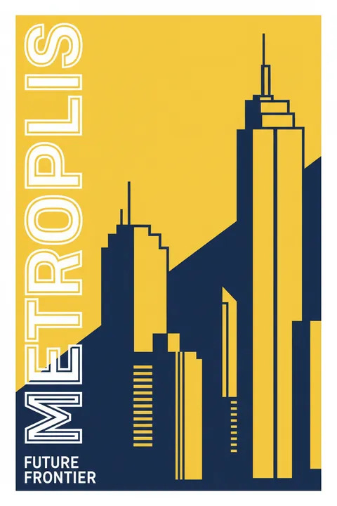
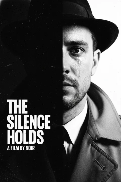
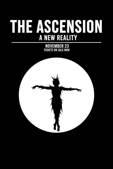
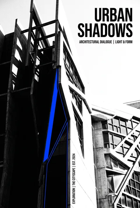
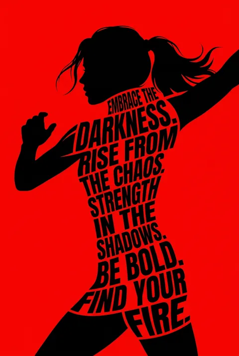
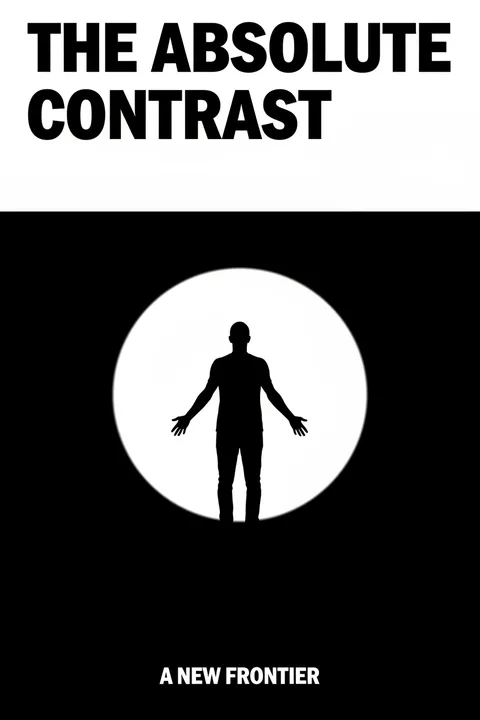
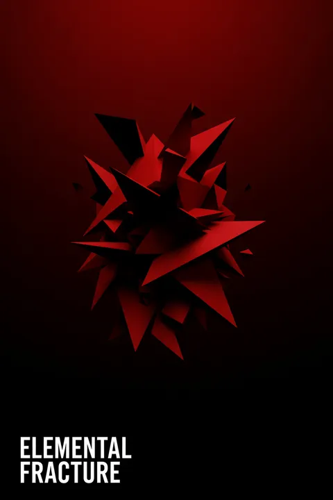
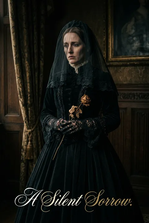
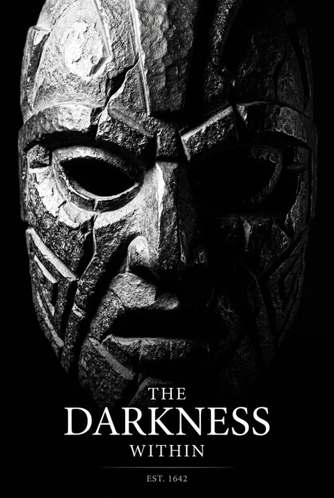
高对比风格源自古老的视觉传统,并经由 Caravaggio 及现代主义设计师如 Saul Bass 等人的不断打磨。它以极端对立为核心理念,摒弃中间色调,将所有元素推向明暗两端,从而营造出紧张而直接的视觉冲击力。高对比设计通过鲜明的视觉极限,使每个细节都成为无法忽视的视觉声明,突出表现力与清晰度。
新用户注册赠送5积分,无需信用卡
商用授权随时取消
风格指南
探索 高对比?
高对比风格源自古老的视觉传统,并经由 Caravaggio 及现代主义设计师如 Saul Bass 等人的不断打磨。它以极端对立为核心理念,摒弃中间色调,将所有元素推向明暗两端,从而营造出紧张而直接的视觉冲击力。高对比设计通过鲜明的视觉极限,使每个细节都成为无法忽视的视觉声明,突出表现力与清晰度。
如何创建 高对比 海报
1
选择您的风格
浏览我们精选的视觉风格,选择最能体现您创意方向的一款。
2
描述您的 高对比 创意
输入您想要的画面描述。我们的 AI 会分析并融合 高对比 风格的精髓。
3
生成并下载
让 AI 发挥魔力。几秒后即可获得高分辨率图片。
为什么选择我们的生成器
专业级功能,人人可用
秒速生成
无需等待。AI 技术让您瞬间获得结果。
商用授权
免费用于个人和商业项目,无隐藏费用。
完全可控
调整提示词、风格和参数,精准实现您的创意。
高清输出
可用于印刷的分辨率,细节清晰锐利。
高对比 风格指南
关于 高对比 设计
高对比风格源自古老的视觉传统,并经由 Caravaggio 及现代主义设计师如 Saul Bass 等人的不断打磨。它以极端对立为核心理念,摒弃中间色调,将所有元素推向明暗两端,从而营造出紧张而直接的视觉冲击力。高对比设计通过鲜明的视觉极限,使每个细节都成为无法忽视的视觉声明,突出表现力与清晰度。
高对比的历史
高对比的视觉策略有着古老的根源——明与暗的鲜明对立创造出基本的视觉戏剧感,被各文化与时代所利用。在西方艺术中,Caravaggio 在17世纪初的 tenebrism 运用了极端的明暗对照来增强宗教性和情感强度。20世纪40–50年代的黑色电影摄影师发展出高对比照明,作为表现道德模糊与心理紧张的视觉语汇。
在平面设计中,高对比利于远距离的最大可读性——这正是交通标志和警示标签采用鲜明颜色对比的原因。现代主义设计师因其清晰与力量而采用高对比手法。Saul Bass 的电影片头展示了大胆的黑白图形如何打造令人难忘的品牌形象。皮影戏和剪纸的剪影传统也为在强烈色调对立中寻找意义提供了先例。
当今的高对比设计出现在任何把即时冲击力和清晰沟通置于优先的位置。该风格超越具体的历史时期,作为一种基本的平面策略,适用于从抗议图像到企业品牌再到美术海报设计等多种语境。
设计哲学
高对比海报设计在对立中寻得力量。这一理念认为,去除中间调会逼迫视觉上的清晰——每个元素必须明确站在明或暗的一边,构成中没有东西能躲进舒适的灰色含糊地带。正是这些极端制造出能够抓住并保持注意力的张力。
核心视觉要素包括鲜明的黑白构图(或在色彩上具有同等调性极端的处理)、以剪影与形状为重心的设计、对中间色调的去除或最小化,以及最大化色调差异的排版与影像。情感表达上则偏向戏剧性、果断且视觉上具攻击性——高对比设计通过对立来掌控注意力,营造出无法忽视的构图。
高对比 常见问题
快速了解 高对比 风格海报创作的关键细节。
高对比度海报设计有什么特点?
高对比度设计使用明暗值之间的极端差异,通常完全消除中间调。这种方法创造戏剧性的视觉冲击,确保出色的可读性,并通过大胆的明暗关系吸引注意力。
哪些视觉技巧能创造高对比度效果?
关键技巧包括用纯黑白取代灰色调、在摄影中使用强烈的光线、将浅色元素放在深色背景上(或反之),以及最大化设计元素之间的明暗差异。
高对比度设计有哪些优势?
优势包括远距离出色的可读性、强烈的视觉冲击力、任何尺寸下都能有效印刷、戏剧性的情感效果,以及在各种观看条件下清晰的信息传达。高对比度确保设计在不同环境中都能表现出色。
什么情况下应该在海报设计中使用高对比度?
高对比度适合戏剧性表达、户外广告、安全标识、大胆的品牌表现,以及需要即时视觉冲击的场景。这种方法适用于黑白摄影、醒目的字体排版和有力的编辑声明。
准备好设计你的下一张海报了吗?
开始创作