
双色调 风格海报
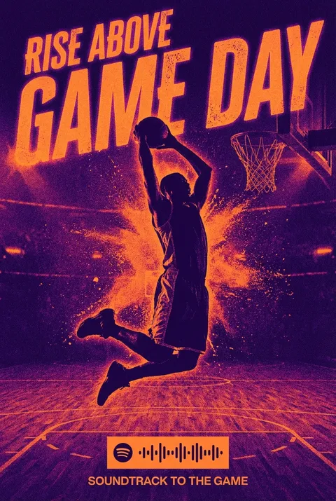
**双色调(Duotone)**最初是在20世纪初作为一种经济高效的印刷方法诞生的,采用两种油墨色彩——常见为黑色配以暖色调——以提升照片的层次和表现力。60年代波普艺术(Pop Art)大胆的视觉风格为其注入新活力,Spotify等当代品牌又让双色调焕发新生。双色调设计理念强调以两种鲜明色彩呈现画面,通过强烈对比和精炼构图,打造出简洁有力且富有情感共鸣的视觉效果。
新用户注册赠送5积分,无需信用卡
探索 双色调?
如何创建 双色调 海报
选择您的风格
浏览我们精选的视觉风格,选择最能体现您创意方向的一款。
描述您的 双色调 创意
输入您想要的画面描述。我们的 AI 会分析并融合 双色调 风格的精髓。
生成并下载
让 AI 发挥魔力。几秒后即可获得高分辨率图片。
为什么选择我们的生成器
专业级功能,人人可用
秒速生成
无需等待。AI 技术让您瞬间获得结果。
商用授权
免费用于个人和商业项目,无隐藏费用。
完全可控
调整提示词、风格和参数,精准实现您的创意。
高清输出
可用于印刷的分辨率,细节清晰锐利。
关于 双色调 设计
双色调的历史
设计哲学
双色调 常见问题
快速了解 双色调 风格海报创作的关键细节。
什么是海报设计中的双色调?
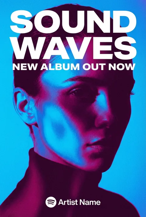
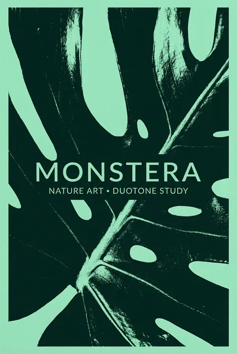
双色调使用两种颜色来创作图像,通常分别对应阴影和高光。这种技术将照片转化为具有独特色彩特征的图形化、风格化图像。现代双色调通常使用超越传统黑色加专色的鲜艳色彩组合。
双色调能创造什么视觉效果?
双色调在简化图像的同时增添了戏剧性的色彩冲击力。这种技术能将照片转化为海报般的图形效果,通过统一的色彩处理整合多样化的图像,并允许大胆的色彩选择——这些在全彩照片中往往难以实现。
哪些颜色组合最适合双色调?
有效的组合包括对比色以获得最大反差、类似色以呈现精致感,或品牌色以保持识别度一致性。常见选择有蓝橙、紫黄、粉蓝和青珊瑚色。最佳组合既能保持图像的可辨识性,又能创造视觉趣味。
什么时候应该在海报设计中使用双色调?
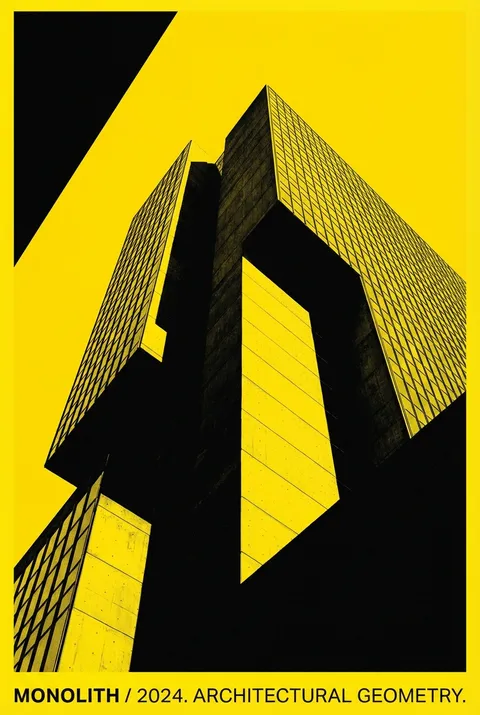
双色调适用于音乐推广、活动海报、编辑设计,以及需要通过独特色彩处理建立识别度的品牌活动。这种技术非常适合统一多样化的图像、创建具有一致美学的系列作品,或将普通照片转化为图形设计元素。
准备好设计你的下一张海报了吗?
开始创作